Pseudotime Trajectories with Slingshot
Single cell trajectory analysis can be defined as a technique to determine the pattern of a dynamic process, such as differentiation, experienced by cells and then arrange them based on their progression through that process.

Over 50 methods developed since 2014. However, the core workflow is similar for all of them:
- Represent Cells by Gene Expression. This generates a high-dimensional space where each dimension is the expression of a specific gene.
- Dimensional Reduction
- Calculate a Minimum Spanning Tree (MST)
- Compute Principal Curves
- Project Cells onto Principal Curves
- Calculate Pseudotime
Although there is no best method, according to Saelens et al. (Nat. Biotechnol. 2019), Slingshot is one of the top ranked methods and that is why I selected it for this post.

Slingshot (Saelens et al., Nat Biotechnol 2019) can work with multiple branches/lineages and has tow main stages:
- Global lineage structure using MST on clustered data points
- Inference of pseudotime variables for cells along each lineage by fitting simultaneous ‘principal curves’ across multiple lineages

We will use two different datasets to reconstruct trajectories using slingshot, make some plots and find genes changing along the trajectories.
Pancreas dataset
Dataset from Bastidas-Ponce et al. (2018) downloaded from scVelo github (https://github.com/theislab/scvelo_notebooks/tree/master/data/Pancreas/endocrinogenesis_day15.h5ad).
Convert the h5ad file to an RDS file using the zellkonverter package. This is a Bioconductor package that allows you to read and write AnnData files in R.
1library(zellkonverter)
2sce <- readH5AD('endocrinogenesis_day15.h5ad')
Inspect the object
1library(SingleCellExperiment)
2library(scater)
3sce
## class: SingleCellExperiment
## dim: 27998 3696
## metadata(5): clusters_coarse_colors clusters_colors day_colors
##   neighbors pca
## assays(3): X spliced unspliced
## rownames(27998): Xkr4 Gm37381 ... Gm20837 Erdr1
## rowData names(1): highly_variable_genes
## colnames(3696): AAACCTGAGAGGGATA AAACCTGAGCCTTGAT ... TTTGTCATCGAATGCT
##   TTTGTCATCTGTTTGT
## colData names(4): clusters_coarse clusters S_score G2M_score
## reducedDimNames(2): X_pca X_umap
## mainExpName: NULL
## altExpNames(0):
Filter non expressed genes
1sce <- sce[rowSums(assay(sce, "X"))>0,]
2dim(sce)
## [1] 17750 3696
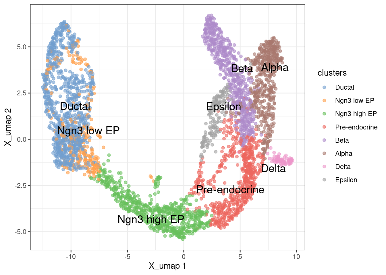
Visualize the cell types on a UMAP plot
1plotReducedDim(sce, 'X_umap', colour_by = 'clusters', text_by = 'clusters') +
2  theme_bw()
Calculate trajectories using slingshot from the UMAP coordinates.
1library(slingshot)
2pto <- slingshot(reducedDim(sce,'X_umap'), clusterLabels = sce$clusters,
3                 start.clus = 'Ductal', end.clus = c('Alpha', 'Beta', 'Delta', 'Epsilon'), spar = 1.1)
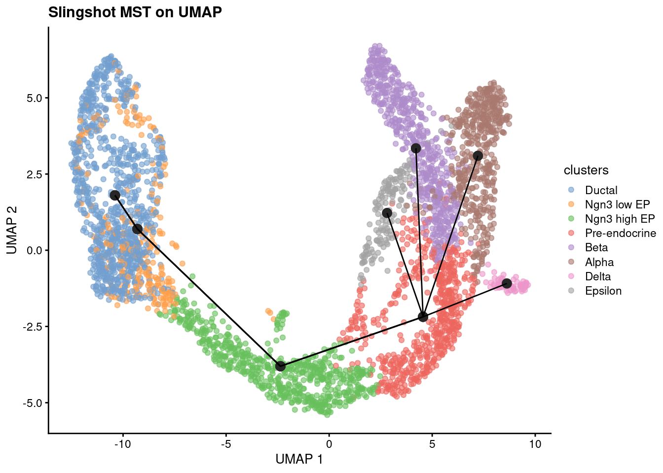
We start checking the Minimum spanning tree (MST) that connects all individual cells or cell states with the minimum total distance, reflecting the shortest path through cellular transitions.
1slsMST <- slingMST(pto, as.df = TRUE)
2plotReducedDim(sce, dimred='X_umap', colour_by = 'clusters') +
3  geom_point(data = slsMST, aes(Dim.1, Dim.2), size = 3, color = "grey15") +
4  geom_path(data = slsMST %>% arrange(Order),
5              aes(Dim.1, Dim.2, group = Lineage)) +
6  labs(title = "Slingshot MST on UMAP", x = "UMAP 1", y = "UMAP 2")
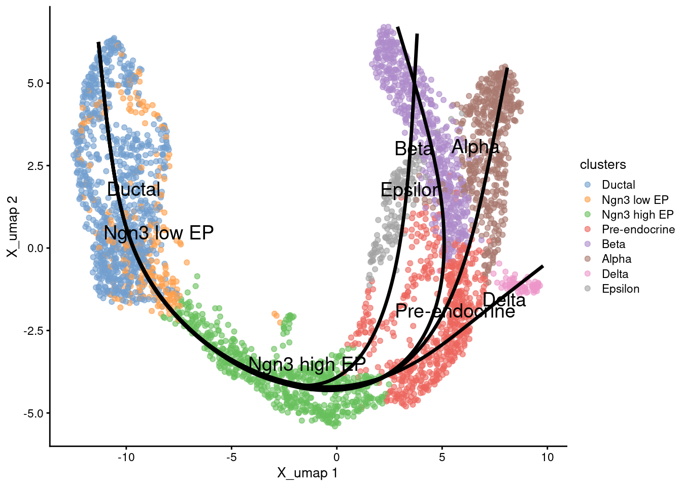
1emb <- embedCurves(pto, reducedDim(sce,'X_umap'))
2emb <- slingCurves(emb)
1g <- plotReducedDim(sce, 'X_umap', text_by = 'clusters', colour_by='clusters')
2for (path in emb) {
3    embedded_curves.df <- data.frame(path$s[path$ord,])
4    g <- g + geom_path(data=embedded_curves.df, aes(x=Dim.1, y=Dim.2), linewidth=1.2)
5}
6print(g)
calculate the UMAP coordinates in 3D for later
1sce <- runUMAP( sce, dimred = 'X_pca',
2                BPPARAM=BiocParallel::MulticoreParam(6),
3                ncomponents = 3, name = 'UMAP_3D'
4              )
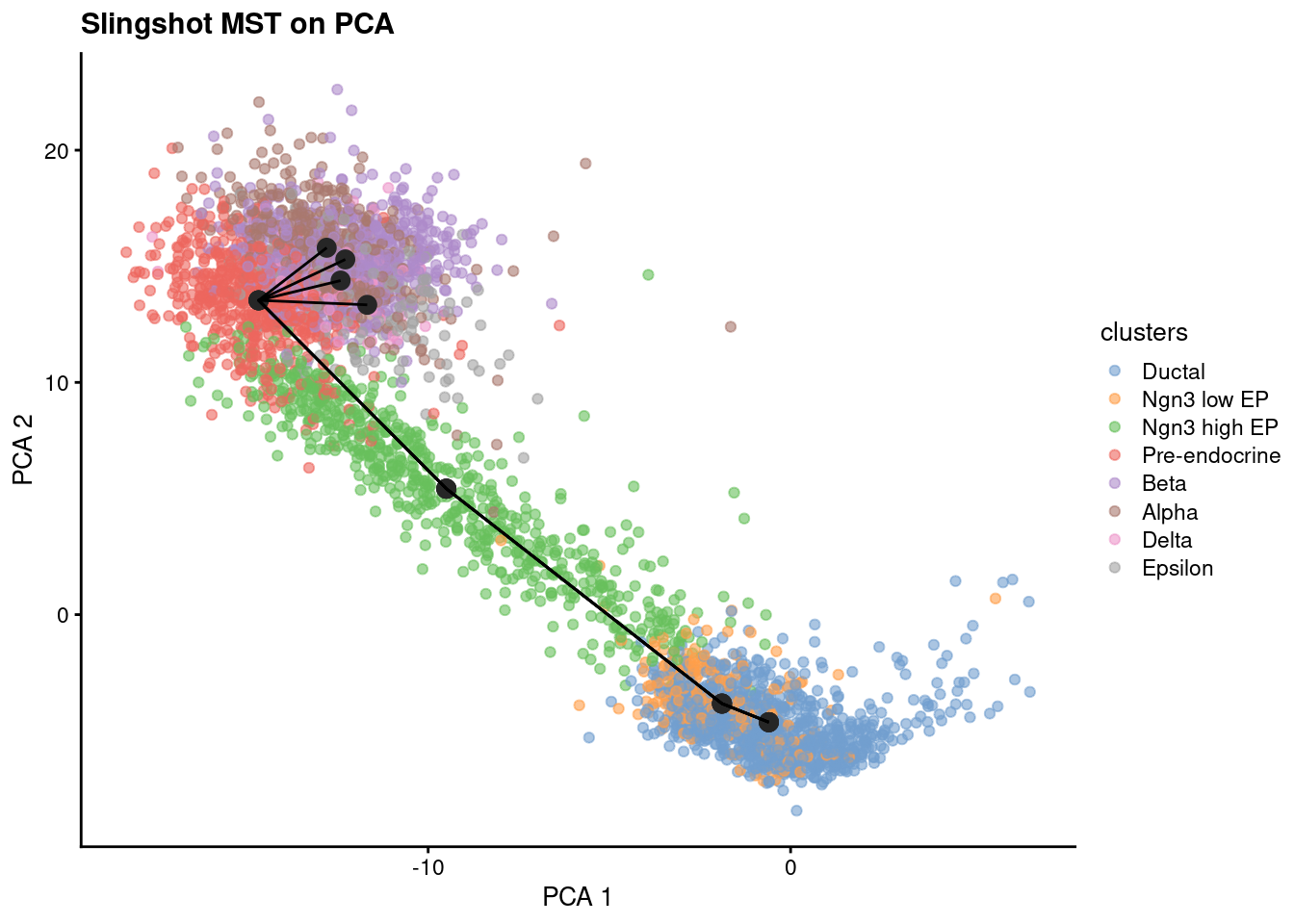
Although this works, it is recommended to calculate the trajectories on the PCA coordinates instead of UMAP. This is because UMAP is a non-linear method and the distances between points are not preserved.
1sce.sling <- slingshot(sce, reducedDim='X_pca', clusterLabels = sce$clusters,
2                     start.clus = 'Ductal', end.clus = c('Alpha', 'Beta', 'Delta', 'Epsilon'), spar = 1.1)
Check MST on PCA coordinates
1slsMST <- slingMST(sce.sling, as.df = TRUE)
2plotReducedDim(sce.sling, dimred='X_pca', colour_by = 'clusters') +
3  geom_point(data = slsMST, aes(Dim.1, Dim.2), size = 3, color = "grey15") +
4  geom_path(data = slsMST %>% arrange(Order),
5              aes(Dim.1, Dim.2, group = Lineage)) +
6  labs(title = "Slingshot MST on PCA", x = "PCA 1", y = "PCA 2")
Calculate the fitted curve for PCA coordinates in the UMAP space
1embedded <- embedCurves(sce.sling, "X_umap")
2embedded <- slingCurves(embedded)
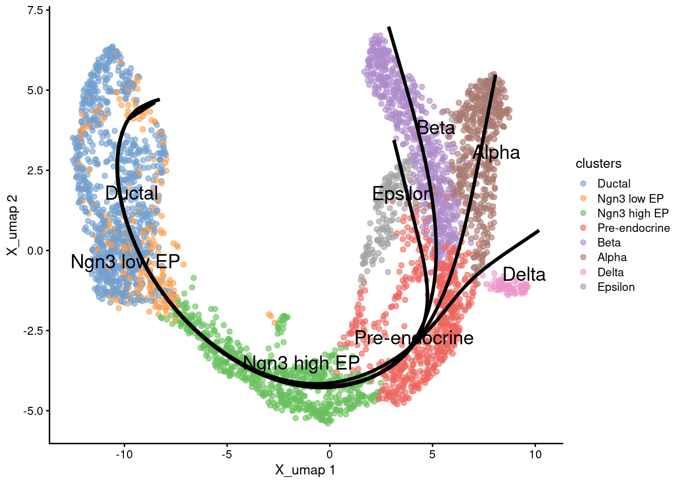
Trajectories on cell types
1g <- plotReducedDim(sce.sling, 'X_umap', text_by = 'clusters', colour_by='clusters')
2for (path in embedded) {
3    embedded_curves.df <- data.frame(path$s[path$ord,])
4    g <- g + geom_path(data=embedded_curves.df, aes(x=Dim.1, y=Dim.2), linewidth=1.2)
5}
6print(g)
Trajectories with common pseudotime. Each lineage has its own pseudotime, we can calculate a common pseudotime for all lineages as the mean of the specific pseudotimes.
1sce.sling$Pseudotime <- rowMeans( slingPseudotime(sce.sling), na.rm=TRUE)
Plot pseudotime in UMAP coordinates.
1g <- plotReducedDim(sce.sling, 'X_umap', text_by = 'clusters', colour_by='Pseudotime')
2for (path in embedded) {
3    embedded_curves.df <- data.frame(path$s[path$ord,])
4    g <- g + geom_path(data=embedded_curves.df, aes(x=Dim.1, y=Dim.2), linewidth=1.2)
5}
6print(g)

Let’s plot the trajectories on 3D. First we must calculate the embedded curves
1embedded <- embedCurves(sce.sling, 'UMAP_3D')
and plot as an interactive plot to visualize the 3D structure
 1library(dplyr)
 2library(plotly)
 3
 4plot.df <- as.data.frame( reducedDim( sce.sling, 'UMAP_3D' ) )
 5plot.df$cluster <- sce.sling[['clusters']]
 6colnames(plot.df) <- c('UMAP1', 'UMAP2', 'UMAP3', 'cluster')
 7redDim <- 'UMAP'
 8
 9p <- plot_ly( ) %>% # colors = trace.colors ) %>%
10  add_trace( data = plot.df,
11             x = ~UMAP1, y = ~UMAP2, z = ~UMAP3,
12             color = ~cluster,
13             type = 'scatter3d',
14             mode = 'markers',
15             marker = list( size = 3, opacity = 1 )
16           )
17
18for (i in 1:4) {
19  embedded_curves.tmp <- slingCurves(embedded)[[i]] # only 1 path
20  embedded_curves.tmp.df <- data.frame(embedded_curves.tmp$s[embedded_curves.tmp$ord,])
21  p <- p %>%
22    add_trace( data = embedded_curves.tmp.df,
23               x = ~UMAP1, y = ~UMAP2, z = ~UMAP3,
24               type = 'scatter3d', mode = "lines",
25               name = paste0("Lineage ", i),
26               line = list( width = 5, opacity = 1 )
27             )
28}
29
30p %>%
31  layout( scene = list( xaxis = list(title = paste0( redDim, '1') ),
32                        yaxis = list(title = paste0( redDim, '2') ),
33                        zaxis = list(title = paste0( redDim, '3') )
34                      )
35        )
 1plot.df$Pseudotime <- sce.sling$Pseudotime
 2
 3p <- plot_ly( ) %>% # colors = trace.colors ) %>%
 4  add_trace( data = plot.df,
 5             x = ~UMAP1, y = ~UMAP2, z = ~UMAP3,
 6             type = 'scatter3d',
 7             mode = 'markers',
 8             showlegend = FALSE,
 9             marker = list( color = ~Pseudotime,
10                            size = 3,
11                            colorscale = 'Viridis', # Viridis color scale
12                            colorbar = list( # Add color scale bar,
13                              title = 'Pseudotime',
14                              x = 1.01,       # horizontal position
15                              y = 0.4,        # vertical position
16                              len = 0.8,      # length (0 to 1, relative to plot height)
17                              thickness = 30  # width in pixels
18                            ),
19                            opacity = 1
20                          )
21           )
22
23for (i in 1:4) {
24  embedded_curves.tmp <- slingCurves(embedded)[[i]] # only 1 path
25  embedded_curves.tmp.df <- data.frame(embedded_curves.tmp$s[embedded_curves.tmp$ord,])
26  p <- p %>%
27    add_trace( data = embedded_curves.tmp.df,
28               x = ~UMAP1, y = ~UMAP2, z = ~UMAP3,
29               type = 'scatter3d', mode = "lines",
30               name = paste0("Lineage ", i),
31               line = list( width = 5, opacity = 1 )
32             )
33}
34
35p %>%
36  layout( scene = list( xaxis = list(title = paste0( redDim, '1') ),
37                        yaxis = list(title = paste0( redDim, '2') ),
38                        zaxis = list(title = paste0( redDim, '3') )
39                      )
40        )
Genes changing along trajectories
First we must normalize the gene expressin matrix
1sce.sling <- logNormCounts(sce.sling, assay.type="X")
2sce.sling
## class: SingleCellExperiment
## dim: 17750 3696
## metadata(5): clusters_coarse_colors clusters_colors day_colors
##   neighbors pca
## assays(4): X spliced unspliced logcounts
## rownames(17750): Xkr4 Mrpl15 ... Gm29650 Erdr1
## rowData names(1): highly_variable_genes
## colnames(3696): AAACCTGAGAGGGATA AAACCTGAGCCTTGAT ... TTTGTCATCGAATGCT
##   TTTGTCATCTGTTTGT
## colData names(11): clusters_coarse clusters ... Pseudotime sizeFactor
## reducedDimNames(3): X_pca X_umap UMAP_3D
## mainExpName: NULL
## altExpNames(0):
Get the genes changing along the pseudotime using splines with the TSCAN package.
1library(TSCAN)
2# scran::testPseudotime(...)
3pseudo <- TSCAN::testPseudotime( sce.sling,
4                          pseudotime=sce.sling$Pseudotime,
5                          BPPARAM=BiocParallel::MulticoreParam(6)
6                        )
Select significant genes.
1# ensembldb::filter(., FDR < 0.05)
2pseudo.sig <- pseudo %>%
3  as.data.frame() %>%
4  dplyr::filter( FDR < 0.05 ) %>%
5  arrange( FDR )
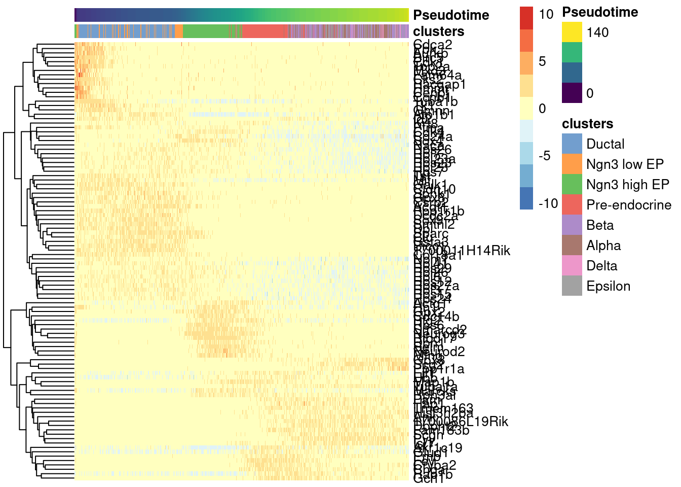
Visualize the top 100 genes in a heatmap.
1topgenes <- rownames(pseudo.sig)[1:100]
2
3plotHeatmap(sce.sling,
4    order_columns_by='Pseudotime',
5    colour_columns_by="clusters",
6    features = topgenes,
7    center=TRUE,
8    scale=TRUE)
Spermatogenesis Data
Dataset from Hermann et al. (2018) downloaded from the scRNAseq package.
1library(scRNAseq)
2sce.sperm <- HermannSpermatogenesisData(strip=TRUE, location=TRUE)
## loading from cache

## require("ensembldb")
1assayNames(sce.sperm)
## [1] "spliced" "unspliced"
Check the object.
1sce.sperm
## class: SingleCellExperiment
## dim: 54448 2325
## metadata(0):
## assays(2): spliced unspliced
## rownames(54448): ENSMUSG00000102693 ENSMUSG00000064842 ...
##   ENSMUSG00000064369 ENSMUSG00000064372
## rowData names(0):
## colnames(2325): CCCATACTCCGAAGAG AATCCAGTCATCTGCC ... ATCCACCCACCACCAG
##   ATTGGTGGTTACCGAT
## colData names(1): celltype
## reducedDimNames(0):
## mainExpName: NULL
## altExpNames(0):
This dataset was originally used for RNA velocity analyses, which uses spliced/unspliced matrices for the velocity calculations. In this analysis we will use the spliced counts as an equivalent to the standard exonic gene counts used in scRNAseq analyses.
Filter non expressed genes
1sce.sperm <- sce.sperm[rowSums(assay(sce.sperm, "spliced"))>0,]
2dim(sce.sperm)
## [1] 29826 2325
Quick single cell preprocessing including 3D UMAP before pseudotime analysis
 1# Quality control:
 2library(scuttle)
 3is.mito <- which(seqnames(sce.sperm)=="MT")
 4sce.sperm <- addPerCellQC(sce.sperm, subsets=list(Mt=is.mito), assay.type="spliced")
 5qc <- quickPerCellQC(colData(sce.sperm), sub.fields=TRUE)
 6sce.sperm <- sce.sperm[,!qc$discard]
 7
 8# Normalization:
 9set.seed(10000)
10library(scran)
##
## Attaching package: 'scran'

## The following objects are masked from 'package:TSCAN':
##
##     createClusterMST, quickPseudotime, testPseudotime

## The following object is masked from 'package:TrajectoryUtils':
##
##     createClusterMST
 1sce.sperm <- logNormCounts(sce.sperm, assay.type="spliced")
 2dec <- modelGeneVarByPoisson(sce.sperm, assay.type="spliced")
 3hvgs <- getTopHVGs(dec, n=2500)
 4
 5# Dimensionality reduction:
 6set.seed(1000101)
 7library(scater)
 8sce.sperm <- runPCA(sce.sperm, subset_row=hvgs,
 9                BPPARAM=BiocParallel::MulticoreParam(6))
10sce.sperm <- runUMAP(sce.sperm, dimred="PCA",
11                BPPARAM=BiocParallel::MulticoreParam(6))
12sce.sperm <- runUMAP( sce.sperm, dimred="PCA",
13                BPPARAM=BiocParallel::MulticoreParam(6),
14                ncomponents = 3, name = 'UMAP_3D'
15              )
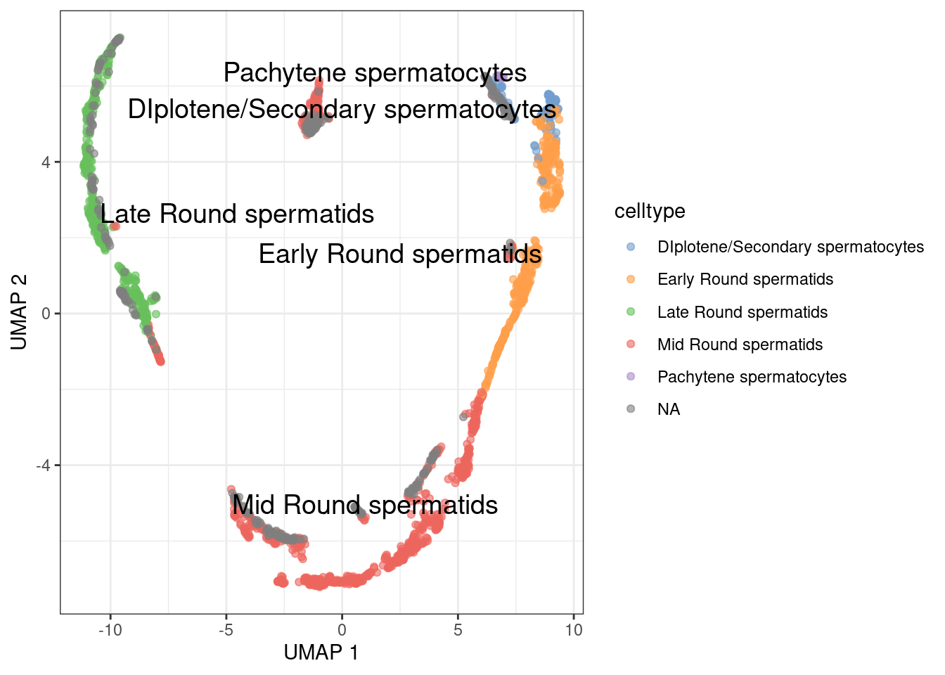
Plot UMAP
1plotUMAP(sce.sperm, colour_by="celltype", text_by="celltype") +
2  theme_bw()
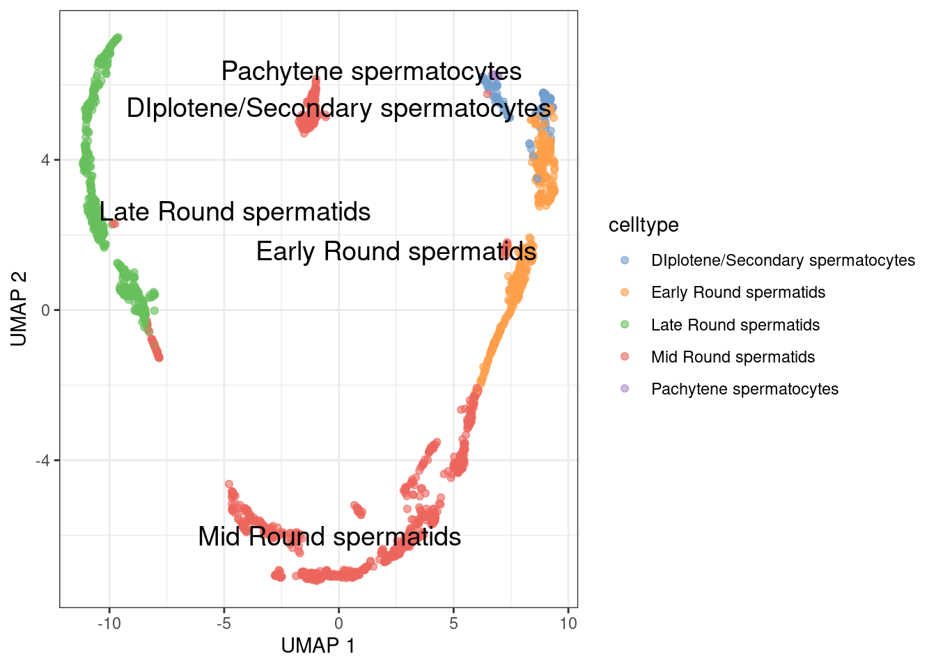
For this test, we will remove the cell without cell type.
1sce.sperm <- sce.sperm[,!is.na(sce.sperm$celltype)]
Check filter in UMAP
1plotUMAP(sce.sperm, colour_by="celltype", text_by="celltype") +
2  theme_bw()
run slingshot on the PCA
1sce.sling <- slingshot(sce.sperm, reducedDim='PCA', clusterLabels = sce.sperm$celltype)
We will skip the MST plot and go directly to embed into UMAP coordinates
1embedded <- embedCurves(sce.sling, "UMAP")
2embedded <- slingCurves(embedded)
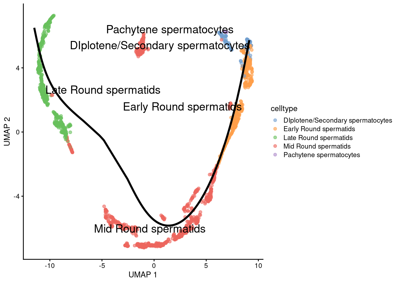
Check trajectory in UMAP
1g <- plotReducedDim(sce.sling, 'UMAP', text_by = 'celltype', colour_by='celltype')
2for (path in embedded) {
3    embedded_curves.df <- data.frame(path$s[path$ord,])
4    g <- g + geom_path(data=embedded_curves.df, aes(x=UMAP1, y=UMAP2), linewidth=1.2)
5}
6print(g)
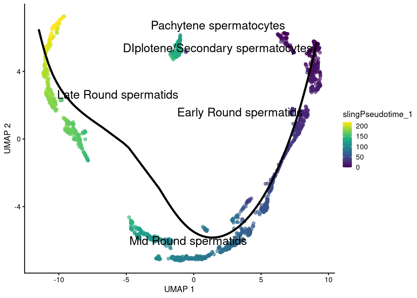
Trajectories with pseudotime. Since there are no multiple lineages there si no need to calculate a common pseudotime.
1g <- plotReducedDim(sce.sling, 'UMAP', text_by = 'celltype', colour_by='slingPseudotime_1')
2for (path in embedded) {
3    embedded_curves.df <- data.frame(path$s[path$ord,])
4    g <- g + geom_path(data=embedded_curves.df, aes(x=UMAP1, y=UMAP2), linewidth=1.2)
5}
6print(g)
Now we can check the trajectories in 3D UMAP coordinates. First step is embedding into 3D UMAP coordinates
1embedded <- embedCurves(sce.sling, "UMAP_3D")
2embedded <- slingCurves(embedded)
Plot in 3D plot
 1plot.df <- as.data.frame( reducedDim( sce.sling, 'UMAP_3D' ) )
 2plot.df$cluster <- sce.sling[['celltype']]
 3colnames(plot.df) <- c('UMAP1', 'UMAP2', 'UMAP3', 'celltype')
 4
 5redDim <- 'UMAP'
 6
 7trace.colors <- c('black', 'blue', 'red', 'orange')
 8names(trace.colors) <- paste0('Trajectory ', 1:4)
 9
10p <- plot_ly( ) %>% # colors = trace.colors ) %>%
11  add_trace( data = plot.df,
12             x = ~UMAP1, y = ~UMAP2, z = ~UMAP3,
13             color = ~celltype,
14             # text = ~paste('Sample:', sample,
15             #               '<br>Cluster:', cluster),
16             # hoverinfo = 'text',
17             type = 'scatter3d',
18             mode = 'markers',
19             marker = list( size = 3, opacity = 1 )
20           )
21
22for (i in 1:length(embedded) ) {
23  path <- embedded[[i]]
24  embedded_curves.tmp.df <- data.frame(path$s[path$ord,])
25  # embedded_curves.tmp.df$cluster <- paste0('Trajectory ', i)
26  p <- p %>%
27    add_trace( data = embedded_curves.tmp.df,
28               x = ~UMAP1, y = ~UMAP2, z = ~UMAP3,
29               type = 'scatter3d', mode = "lines",
30               name = paste0("Trajectory ", i),
31               line = list( width = 5, opacity = 1 , color = paste0('Lineage ', i) )
32             )
33}
34
35p %>%
36  layout( scene = list( xaxis = list(title = paste0( redDim, '1') ),
37                        yaxis = list(title = paste0( redDim, '2') ),
38                        zaxis = list(title = paste0( redDim, '3') )
39                      )
40        )
Now we can check the pseudotime in the 3D UMAP coordinates. We will use the slingPseudotime_1 pseudotime.
 1plot.df$Pseudotime <- sce.sling$slingPseudotime_1
 2p <- plot_ly( ) %>% # colors = trace.colors ) %>%
 3  add_trace( data = plot.df,
 4             x = ~UMAP1, y = ~UMAP2, z = ~UMAP3,
 5             # text = ~paste('Sample:', sample,
 6             #               '<br>Cluster:', cluster),
 7             # hoverinfo = 'text',
 8             type = 'scatter3d',
 9             mode = 'markers',
10             showlegend = FALSE,
11             marker = list( color = ~Pseudotime,
12                            size = 3,
13                            colorscale = 'Viridis', # Viridis color scale
14                            colorbar = list( # Add color scale bar,
15                              title = 'Pseudotime'
16                            ),
17                            opacity = 1
18                          )
19           )
20
21for (i in 1:length(embedded) ) {
22  path <- embedded[[i]]
23  embedded_curves.tmp.df <- data.frame(path$s[path$ord,])
24  p <- p %>%
25    add_trace( data = embedded_curves.tmp.df,
26               x = ~UMAP1, y = ~UMAP2, z = ~UMAP3,
27               type = 'scatter3d', mode = "lines",
28               name = paste0("Trajectory ", i),
29               showlegend = TRUE,
30               line = list( width = 5, opacity = 1 , color = 'black' )
31             )
32}
33
34p %>%
35  layout( scene = list( xaxis = list(title = paste0( redDim, '1') ),
36                        yaxis = list(title = paste0( redDim, '2') ),
37                        zaxis = list(title = paste0( redDim, '3') )
38                      )
39        )
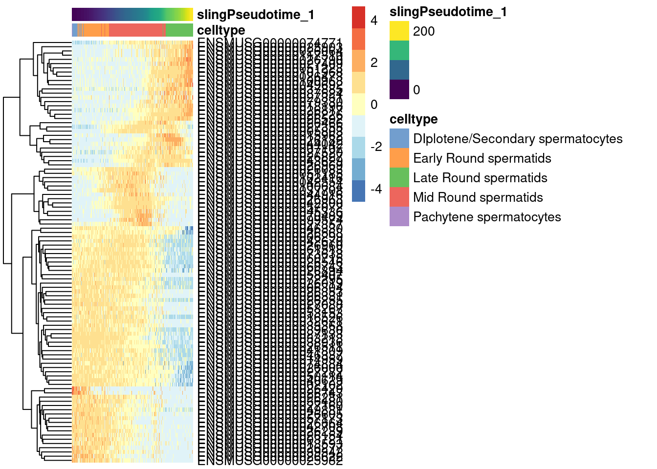
Genes changing along trajectories
As before, we use TSCAN to find genes changing along the pseudotime
1pseudo <- TSCAN::testPseudotime( logcounts(sce.sling),
2                          pseudotime=sce.sling$slingPseudotime_1,
3                          BPPARAM=BiocParallel::MulticoreParam(6)
4                        )
Select significant genes.
1pseudo.sig <- pseudo %>%
2  as.data.frame() %>%
3  dplyr::filter( FDR < 0.05 ) %>%
4  arrange( FDR )
Visualize the top 100 genes in a heatmap.
1topgenes <- rownames(pseudo.sig)[1:100]
2
3plotHeatmap(sce.sling,
4    order_columns_by='slingPseudotime_1',
5    colour_columns_by="celltype",
6    features = topgenes,
7    center=TRUE,
8    scale=TRUE)
Conclusions
- Slingshot can reconstruct pseudotime trajectories for both datasets.
- Fitting linear models using splines is a good method to detect genes changing along the pseudotime.
Take away
- It is advised to calculate trajectories on the PCA coordinates and then project them onto tSNE/UMAP coordinates.
- No “one size fits all” method to calculate pseudotime trajectories.
- Multiple methods to evaluate differential gene expression along pseudotime.
Further reading
- Saelens et al. (2019). A comparison of single-cell trajectory inference methods. Nat Biotechnol.
- Slingshot: cell lineage and pseudotime inference for single-cell transcriptomics. Publication
- Slingshot. Bioconductor package
- Slingshot. Bioconductor vignette
- Monocle 3. An analysis toolkit for single-cell RNA-seq.
- “Orchestrating Single-Cell Analysis with Bioconductor” book. Trajectory Analysis. Principal curves
- Single-cell best practices: Pseudotemporal ordering
- A guide to trajectory inference and RNA velocity