Pseudotime Trajectory vs RNA Velocity
My previous two post of this series focused on Pseudotime trajectories and RNA velocity analysis, two different computational methods to study the dynamics of single cell processes.
Although both are well established methods, there is not too much information about how they compare. In this post, I will compare both methods building up on the results of my previous posts. I will focus on three points for this comparisons:
- Differentiation time
- Relevant genes
- Functional analysis
Differentiation time
Here we will compare the pseudotime trajectories and RNA velocity pseudotime values. The idea is to see if both methods return similar results.
Pancreas data
Read the SCE object with slingshot results
1pancreas.list <- readRDS('pancreas.slingshot.rds')
Check the contents
1pancreas.list$sce.sling
## class: SingleCellExperiment
## dim: 17750 3696
## metadata(5): clusters_coarse_colors clusters_colors day_colors
##   neighbors pca
## assays(4): X spliced unspliced logcounts
## rownames(17750): Xkr4 Mrpl15 ... Gm29650 Erdr1
## rowData names(1): highly_variable_genes
## colnames(3696): AAACCTGAGAGGGATA AAACCTGAGCCTTGAT ... TTTGTCATCGAATGCT
##   TTTGTCATCTGTTTGT
## colData names(11): clusters_coarse clusters ... Pseudotime sizeFactor
## reducedDimNames(3): X_pca X_umap UMAP_3D
## mainExpName: NULL
## altExpNames(0):
1pancreas.list$pseudo
## DataFrame with 17750 rows and 3 columns
##                      logFC     p.value         FDR
##                  <numeric>   <numeric>   <numeric>
## Xkr4           1.59668e-05 7.11150e-01 7.62024e-01
## Mrpl15        -1.14399e-03 1.26515e-11 3.82822e-11
## Rgs20         -2.17599e-06 2.85491e-01 3.61574e-01
## Npbwr1         1.54452e-05 3.74468e-01 4.56199e-01
## 4732440D04Rik  5.59785e-05 2.28204e-01 2.98168e-01
## ...                    ...         ...         ...
## Ddx3y          8.99105e-04 2.45525e-06 5.57440e-06
## Kdm5d          2.67129e-05 9.96478e-01 9.97096e-01
## Eif2s3y        2.30802e-04 9.70613e-09 2.56146e-08
## Gm29650        3.61258e-05 2.45644e-01 3.18053e-01
## Erdr1         -7.28370e-04 8.18582e-08 2.04646e-07
Read RNA velocity latent time and pseudotime values for each cell
1pancreas.df <- read.csv('pancreas.pseudotime.csv')
Let’s take a look
1knitr::kable(head(pancreas.df), align = "c")
| cell_id | latent_time | velocity_pseudotime |
|---|---|---|
| AAACCTGAGAGGGATA | 0.7683599 | 0.8240714 |
| AAACCTGAGCCTTGAT | 0.0887799 | 0.0703552 |
| AAACCTGAGGCAATTA | 0.8441372 | 0.8546980 |
| AAACCTGCATCATCCC | 0.1929448 | 0.0122906 |
| AAACCTGGTAAGTGGC | 0.6399939 | 0.5950702 |
| AAACCTGGTATTAGCC | 0.0876979 | 0.0780502 |
Prep data for the comparison
1if ( identical( colnames(pancreas.list$sce.sling), pancreas.df$cell_id ) ){
2  plot.df <- pancreas.df
3  plot.df$slingshot.pseudotime <- pancreas.list$sce.sling$Pseudotime
4  plot.df$celltype <- pancreas.list$sce.sling[['clusters']]
5}
I will use the pearson correlation between the different times as a similarity measure.
 1# Select relevant variables
 2df <- plot.df %>%
 3  select(slingshot.pseudotime, latent_time, velocity_pseudotime)
 4
 5# Variable names
 6vars <- colnames(df)
 7n <- length(vars)
 8
 9# Initialize empty matrix
10result <- matrix("", n, n, dimnames = list(vars, vars))
11
12# Fill the matrix
13for (i in 1:n) {
14  for (j in 1:n) {
15    if (i == j) {
16      result[i, j] <- "1"
17    } else if (i < j) {
18      r <- cor(df[[i]], df[[j]], method = "pearson", use = "complete.obs")
19      result[i, j] <- sprintf("%.2f", r)
20    } else {
21      p <- cor.test(df[[i]], df[[j]], method = "pearson")$p.value
22      result[i, j] <- sprintf("%.3f", p)
23    }
24  }
25}
26knitr::kable(result, align = "c")
| slingshot.pseudotime | latent_time | velocity_pseudotime | |
|---|---|---|---|
| slingshot.pseudotime | 1 | 0.96 | 0.98 |
| latent_time | 0.000 | 1 | 0.98 |
| velocity_pseudotime | 0.000 | 0.000 | 1 |
The upper triangular matrix shows the correlation between the different times. The lower triangular matrix shows the p-value of the correlation test. It is clear the three values are highly correlated.
Let’s plot the data to visualize this high correlation.
 1plot_ly( data = plot.df,
 2         x = ~slingshot.pseudotime, y = ~latent_time, z = ~velocity_pseudotime,
 3         color = ~celltype,
 4         text = ~paste0('Cell Type: ', celltype,
 5                        '<br>x: ', slingshot.pseudotime,
 6                        '<br>y: ', latent_time,
 7                        '<br>z: ', velocity_pseudotime
 8                       ),
 9         hoverinfo = 'text',
10         type = 'scatter3d',
11         mode = 'markers',
12         marker = list( size = 3, opacity = 1 )
13       ) %>%
14  layout( scene = list( xaxis = list(title = 'Slingshot Pseudotime' ),
15                        yaxis = list(title = 'Latent Time' ),
16                        zaxis = list(title = 'Velocity Pseudotime' )
17                      )
18        )
Spermatogenesis Data
Read the SCE object with slingshot results
1spermatogenesis.list <- readRDS('spermatogenesis.slingshot.rds')
Check the data
1spermatogenesis.list$sce.sling
## class: SingleCellExperiment
## dim: 29826 1816
## metadata(0):
## assays(3): spliced unspliced logcounts
## rownames(29826): ENSMUSG00000102693 ENSMUSG00000102851 ...
##   ENSMUSG00000064370 ENSMUSG00000064368
## rowData names(0):
## colnames(1816): CCCATACTCCGAAGAG AATCCAGTCATCTGCC ... TCGCGTTCAAGAGTCG
##   CACCTTGCAGATCGGA
## colData names(10): celltype sum ... slingshot slingPseudotime_1
## reducedDimNames(3): PCA UMAP UMAP_3D
## mainExpName: NULL
## altExpNames(0):
1spermatogenesis.list$pseudo
## DataFrame with 29826 rows and 3 columns
##                           logFC      p.value          FDR
##                       <numeric>    <numeric>    <numeric>
## ENSMUSG00000102693 -3.90295e-05  7.82068e-04  1.49908e-03
## ENSMUSG00000102851 -5.63010e-06  5.32041e-01  6.12192e-01
## ENSMUSG00000104238 -7.74966e-04  8.24446e-07  1.83290e-06
## ENSMUSG00000102735  9.26482e-05  2.91760e-10  7.24883e-10
## ENSMUSG00000103922  2.20297e-05  3.53919e-01  4.52473e-01
## ...                         ...          ...          ...
## ENSMUSG00000065947 -0.000367090  7.72572e-11  1.94957e-10
## ENSMUSG00000064363 -0.010871906 2.88111e-204 3.55271e-203
## ENSMUSG00000064367 -0.001970639  2.03069e-44  8.49799e-44
## ENSMUSG00000064370 -0.007406681 7.92214e-116 5.91793e-115
## ENSMUSG00000064368 -0.000101004  3.06408e-04  6.03777e-04
Read RNA velocity latent time and pseudotime values for each cell
1spermatogenesis.df <- read.csv('spermatogenesis.pseudotime.csv')
Let’s take a look
1knitr::kable(head(spermatogenesis.df), align = "c")
| cell_id | latent_time | velocity_pseudotime |
|---|---|---|
| CCCATACTCCGAAGAG | 0.6637889 | 0.1879257 |
| AATCCAGTCATCTGCC | 0.6618376 | 0.1870022 |
| GACTGCGGTTTGACTG | 0.6386428 | 0.1808008 |
| ACACCAATCTTCGGTC | 0.6613600 | 0.1890373 |
| TGACAACAGGACAGAA | 0.0158461 | 0.1032971 |
| TTGGAACAGGCGTACA | 0.0862924 | 0.0754072 |
Prep data
1if ( identical( colnames(spermatogenesis.list$sce.sling), spermatogenesis.df$cell_id ) ){
2  plot.df <- spermatogenesis.df
3  plot.df$slingshot.pseudotime <- spermatogenesis.list$sce.sling$slingPseudotime_1
4  plot.df$celltype <- spermatogenesis.list$sce.sling[['celltype']]
5}
Calculate the correlation as before.
 1# Select relevant variables
 2df <- plot.df %>%
 3  select(slingshot.pseudotime, latent_time, velocity_pseudotime)
 4
 5# Variable names
 6vars <- colnames(df)
 7n <- length(vars)
 8
 9# Initialize empty matrix
10result <- matrix("", n, n, dimnames = list(vars, vars))
11
12# Fill the matrix
13for (i in 1:n) {
14  for (j in 1:n) {
15    if (i == j) {
16      result[i, j] <- "1"
17    } else if (i < j) {
18      r <- cor(df[[i]], df[[j]], method = "pearson", use = "complete.obs")
19      result[i, j] <- sprintf("%.2f", r)
20    } else {
21      p <- cor.test(df[[i]], df[[j]], method = "pearson")$p.value
22      result[i, j] <- sprintf("%.3f", p)
23    }
24  }
25}
26knitr::kable(result, align = "c")
| slingshot.pseudotime | latent_time | velocity_pseudotime | |
|---|---|---|---|
| slingshot.pseudotime | 1 | 0.67 | 0.73 |
| latent_time | 0.000 | 1 | 0.75 |
| velocity_pseudotime | 0.000 | 0.000 | 1 |
We can see this time the correlatio is not as high as before. The p-values are good, although with the number of cells we are using this is kind of expected.
Let’s visualize to see what is going on.
 1plot_ly( data = plot.df,
 2         x = ~slingshot.pseudotime, y = ~latent_time, z = ~velocity_pseudotime,
 3         color = ~celltype,
 4         text = ~paste0('Cell Type: ', celltype,
 5                        '<br>x: ', slingshot.pseudotime,
 6                        '<br>y: ', latent_time,
 7                        '<br>z: ', velocity_pseudotime
 8                       ),
 9         hoverinfo = 'text',
10         type = 'scatter3d',
11         mode = 'markers',
12         marker = list( size = 3, opacity = 1 )
13       ) %>%
14  layout( scene = list( xaxis = list(title = 'Slingshot Pseudotime' ),
15                        yaxis = list(title = 'Latent Time' ),
16                        zaxis = list(title = 'Velocity Pseudotime' )
17                      )
18        )
There is correlation among the values but it is not as linear as in the previous example.
Relevant genes
In my previous post we described genes associated/important for the differentiation process. Here we will compare the genes selected by both methods to see if they agree.
Pancreas dataset
Here we read the genes and the likelihood values from the RNA velocity analysis. The significant genes for the slingshot analysis were already loaded at the same time than the SCE object.
1pancreas.genes.df <- read.csv('pancreas.likelihood.genes.csv')
I will the use the top 200 genes to build a Venn diagram and see how many genes are shared between the two methods.
 1gene.num <- 200
 2dataset <- "pancreas"
 3namedGenesList <- list( slingshot = pancreas.list$pseudo %>%
 4  as.data.frame() %>%
 5  dplyr::filter( FDR < 0.05 ) %>%
 6  arrange( FDR ) %>%
 7  tibble::rownames_to_column( var = "gene" ) %>%
 8  head( gene.num  ) %>%
 9  pull(gene),
10  velocity = pancreas.genes.df %>%
11    head( gene.num  ) %>%
12    pull(gene)
13)
14venn.diagram( namedGenesList,
15                  paste0(dataset, "Venn.diagram.tiff"),
16                  fill=wes_palette("FantasticFox1")[1:length(namedGenesList)],
17                  alpha=rep( 0.25, length(namedGenesList) ),
18                  cex = 2.5, cat.fontface=4,
19                  category.names = names(namedGenesList),
20                  col=wes_palette("FantasticFox1")[1:length(namedGenesList)]
21                )
## [1] 1
1log.files <- list.files('.', pattern = "*Venn.diagram.*.log", full.names = T)
2file.remove(log.files)
## [1] TRUE
1cmd <- paste0( 'convert ', dataset, 'Venn.diagram.tiff ', dataset, 'Venn.diagram.png && rm ', dataset, 'Venn.diagram.tiff ' )
2system( cmd )

Interestingly, the number of genes in common is low even though the correlation between the pseudotime values was very high.
Spermatogenesis Dataset
Read RNA velocity genes and likelihood values.
1spermatogenesis.genes.df <- read.csv('spermatogenesis.likelihood.genes.csv')
Venn diagram
 1gene.num <- 200
 2dataset <- "spermatogenesis"
 3namedGenesList <- list( slingshot = spermatogenesis.list$pseudo %>%
 4  as.data.frame() %>%
 5  dplyr::filter( FDR < 0.05 ) %>%
 6  arrange( FDR ) %>%
 7  tibble::rownames_to_column( var = "gene" ) %>%
 8  head( gene.num  ) %>%
 9  pull(gene),
10  velocity = spermatogenesis.genes.df %>%
11    head( gene.num  ) %>%
12    pull(gene)
13)
14venn.diagram( namedGenesList,
15              paste0(dataset, "Venn.diagram.tiff"),
16              fill=wes_palette("FantasticFox1")[1:length(namedGenesList)],
17              alpha=rep( 0.25, length(namedGenesList) ),
18              cex = 2.5, cat.fontface=4,
19              category.names = names(namedGenesList),
20              col=wes_palette("FantasticFox1")[1:length(namedGenesList)]
21            )
## [1] 1
1log.files <- list.files('.', pattern = "*Venn.diagram.*.log", full.names = T)
2file.remove(log.files)
## [1] TRUE
1cmd <- paste0( 'convert ', dataset, 'Venn.diagram.tiff ', dataset, 'Venn.diagram.png && rm ', dataset, 'Venn.diagram.tiff ' )
2system( cmd )

Here the number of common genes is even lower. This must be reflecting the lower correlation between the pseudotime values for this dataset.
Functional analysis
I did not plan to include this section but since the number of common genes is low in general, I decided to include it to see if the results are more similar when we evaluate the functional enrichment of the genes instead of the specific genes.
I will use the same top 200 genes for this analysis.
Pancreas dataset
load libraries for the enrichment analysis, including mouse annotation.
1library(clusterProfiler)
2library(org.Mm.eg.db)
Prepare the enrichment analysis for slingshot top 200 genes.
1slingshot.pancreas.ORA.genes <- pancreas.list$pseudo %>%
2  as.data.frame() %>%
3  dplyr::filter( FDR < 0.05 ) %>%
4  arrange( FDR ) %>%
5  tibble::rownames_to_column( var = "gene" ) %>%
6  head( gene.num  ) %>%
7  pull(gene)
Enrichment analysis by overrepresentation analysis (ORA)
1slingshot.pancreas.ORA <- enrichGO(
2  gene          = slingshot.pancreas.ORA.genes,
3  OrgDb         = org.Mm.eg.db,
4  keyType       = "SYMBOL",
5  ont           = "BP",
6  pAdjustMethod = "BH",
7  pvalueCutoff  = 0.05,
8  qvalueCutoff  = 0.05
9)
For this quick test I just went with the default setting for universe, which uses all annotated genes in the database. This is, however, debatable and it is usually advised to use only the set of genes expressed in the experiment or tissue:
— Wijesooriya K., et al (2022) Urgent need for consistent standards in functional enrichment analysis. PLOS Computational Biology 18(3): e1009935
— Ludwig Geistlinger., (2021), Toward a gold standard for benchmarking gene set enrichment analysis, Briefings in Bioinformatics, Volume 22, Issue 1, Pages 545–556
— biostars forum
check results
1knitr::kable(slingshot.pancreas.ORA %>%
2               as.data.frame() %>%
3               dplyr::select(-geneID) %>%
4               head(),
5             align = "c")
| ID | Description | GeneRatio | BgRatio | RichFactor | FoldEnrichment | zScore | pvalue | p.adjust | qvalue | Count | |
|---|---|---|---|---|---|---|---|---|---|---|---|
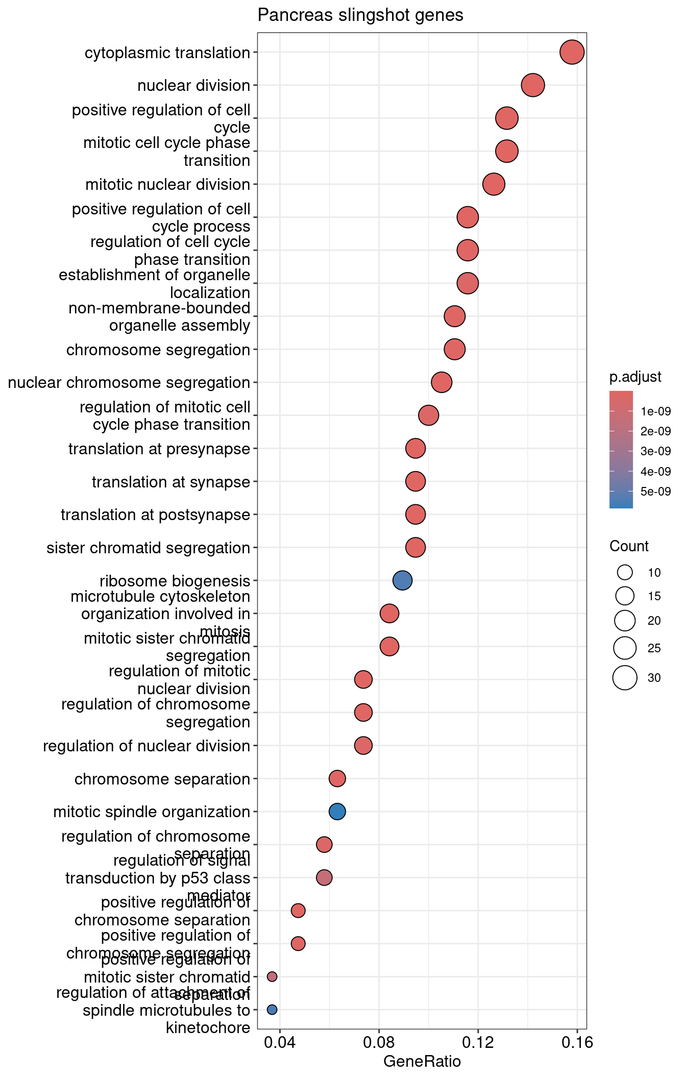
| GO:0002181 | GO:0002181 | cytoplasmic translation | 30/190 | 153/28905 | 0.1960784 | 29.82972 | 29.08396 | 0 | 0 | 0 | 30 |
| GO:0140236 | GO:0140236 | translation at presynapse | 18/190 | 47/28905 | 0.3829787 | 58.26316 | 31.95895 | 0 | 0 | 0 | 18 |
| GO:0140241 | GO:0140241 | translation at synapse | 18/190 | 48/28905 | 0.3750000 | 57.04934 | 31.61309 | 0 | 0 | 0 | 18 |
| GO:0140242 | GO:0140242 | translation at postsynapse | 18/190 | 48/28905 | 0.3750000 | 57.04934 | 31.61309 | 0 | 0 | 0 | 18 |
| GO:0140014 | GO:0140014 | mitotic nuclear division | 24/190 | 270/28905 | 0.0888889 | 13.52281 | 16.81653 | 0 | 0 | 0 | 24 |
| GO:0045787 | GO:0045787 | positive regulation of cell cycle | 25/190 | 359/28905 | 0.0696379 | 10.59412 | 14.87925 | 0 | 0 | 0 | 25 |
visualize top 30 as dotplot
1dotplot(slingshot.pancreas.ORA, showCategory=30) +
2  ggtitle("Pancreas slingshot genes")
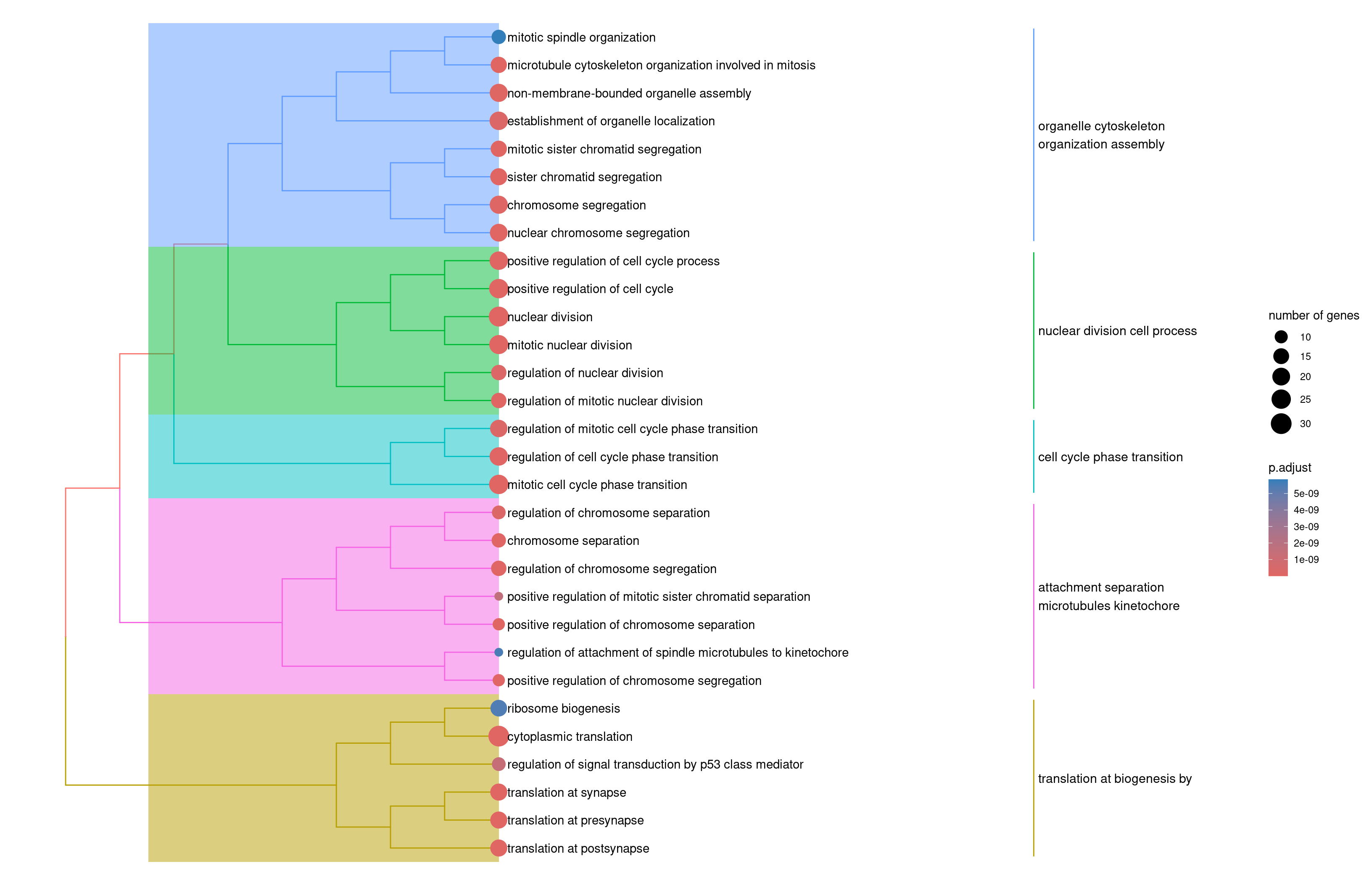
Use a tree plot to summarize the main funcions
1slingshot.pancreas.ORA2 <- enrichplot::pairwise_termsim(slingshot.pancreas.ORA)
2enrichplot::treeplot(slingshot.pancreas.ORA2)
Prep velocity genes.
1velocity.pancreas.ORA.genes <- pancreas.genes.df %>%
2    head( gene.num  ) %>%
3    pull(gene)
Enrichment analysis
1velocity.pancreas.ORA <- enrichGO(
2  gene          = velocity.pancreas.ORA.genes,
3  OrgDb         = org.Mm.eg.db,
4  keyType       = "SYMBOL",
5  ont           = "BP",
6  pAdjustMethod = "BH",
7  pvalueCutoff  = 0.05,
8  qvalueCutoff  = 0.05
9)
check results
1knitr::kable(velocity.pancreas.ORA %>%
2               as.data.frame() %>%
3               dplyr::select(-geneID) %>%
4               head(),
5             align = "c")
| ID | Description | GeneRatio | BgRatio | RichFactor | FoldEnrichment | zScore | pvalue | p.adjust | qvalue | Count | |
|---|---|---|---|---|---|---|---|---|---|---|---|
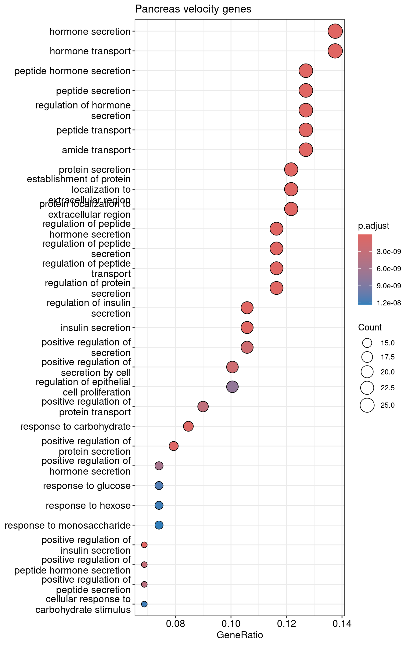
| GO:0030072 | GO:0030072 | peptide hormone secretion | 24/189 | 322/28905 | 0.0745342 | 11.398994 | 15.22346 | 0 | 0 | 0 | 24 |
| GO:0046879 | GO:0046879 | hormone secretion | 26/189 | 405/28905 | 0.0641975 | 9.818146 | 14.49874 | 0 | 0 | 0 | 26 |
| GO:0002790 | GO:0002790 | peptide secretion | 24/189 | 330/28905 | 0.0727273 | 11.122655 | 15.00397 | 0 | 0 | 0 | 24 |
| GO:0009914 | GO:0009914 | hormone transport | 26/189 | 413/28905 | 0.0629540 | 9.627964 | 14.32748 | 0 | 0 | 0 | 26 |
| GO:0090276 | GO:0090276 | regulation of peptide hormone secretion | 22/189 | 265/28905 | 0.0830189 | 12.696616 | 15.51831 | 0 | 0 | 0 | 22 |
| GO:0046883 | GO:0046883 | regulation of hormone secretion | 24/189 | 339/28905 | 0.0707965 | 10.827363 | 14.76590 | 0 | 0 | 0 | 24 |
dotplot
1dotplot(velocity.pancreas.ORA, showCategory=30) + ggtitle("Pancreas velocity genes")
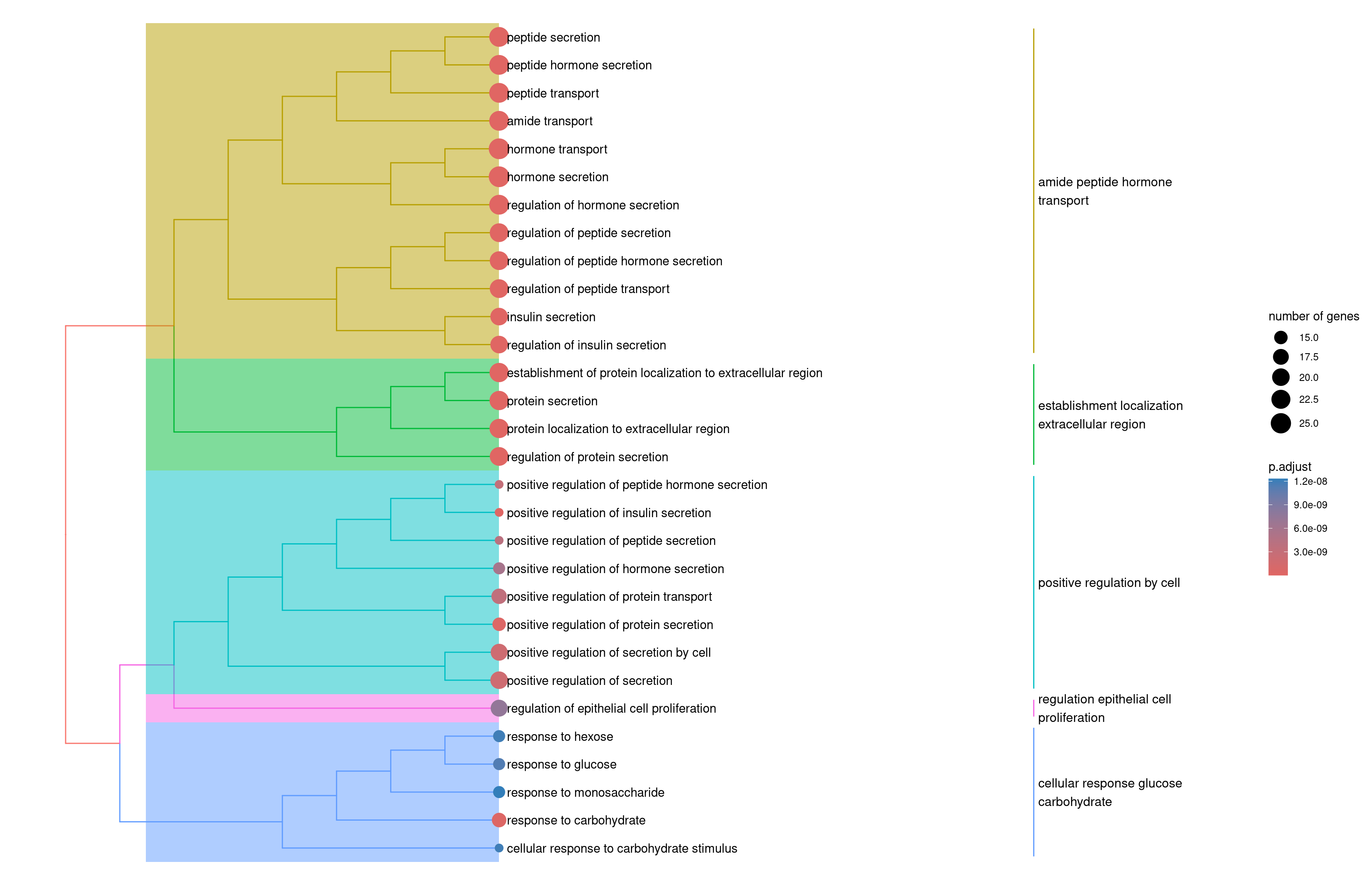
tree plot
1velocity.pancreas.ORA2 <- enrichplot::pairwise_termsim(velocity.pancreas.ORA)
2enrichplot::treeplot(velocity.pancreas.ORA2)
Venn diagram to compare the GO enrichment results
 1dataset <- 'pancreas.GO'
 2venn.diagram( list( slingshot = slingshot.pancreas.ORA %>%
 3                                   as.data.frame() %>%
 4                                   pull(Description ),
 5                    velocity = velocity.pancreas.ORA %>%
 6                                 as.data.frame() %>%
 7                                 pull(Description )
 8                  ),
 9              paste0(dataset, "Venn.diagram.tiff"),
10              fill=wes_palette("FantasticFox1")[1:length(namedGenesList)],
11              alpha=rep( 0.25, length(namedGenesList) ),
12              cex = 2.5, cat.fontface=4,
13              category.names = names(namedGenesList),
14              col=wes_palette("FantasticFox1")[1:length(namedGenesList)]
15            )
## [1] 1
1log.files <- list.files('.', pattern = "*Venn.diagram.*.log", full.names = T)
2file.remove(log.files)
## [1] TRUE
1cmd <- paste0( 'convert ', dataset, 'Venn.diagram.tiff ', dataset, 'Venn.diagram.png && rm ', dataset, 'Venn.diagram.tiff ' )
2system( cmd )

Interestingly there are more common GOs (in proportion) than genes. This is probably suggesting than, although the genes are not the same, they are related to similar processes.
spermatogenesis dataset
Prep slingshot genes
1slingshot.spermatogenesis.ORA.genes <- spermatogenesis.list$pseudo %>%
2  as.data.frame() %>%
3  dplyr::filter( FDR < 0.05 ) %>%
4  arrange( FDR ) %>%
5  tibble::rownames_to_column( var = "gene" ) %>%
6  head( gene.num  ) %>%
7  pull(gene)
Enrichment analysis, note that the command change a little since each dataset stores the genes with a different identifier.
1slingshot.spermatogenesis.ORA <- enrichGO(
2  gene          = slingshot.spermatogenesis.ORA.genes,
3  OrgDb         = org.Mm.eg.db,
4  keyType       = "ENSEMBL",
5  ont           = "BP",
6  pAdjustMethod = "BH",
7  pvalueCutoff  = 0.05,
8  qvalueCutoff  = 0.05
9)
check results
1knitr::kable(slingshot.spermatogenesis.ORA %>%
2               as.data.frame() %>%
3               dplyr::select(-geneID) %>%
4               head(),
5             align = "c")
| ID | Description | GeneRatio | BgRatio | RichFactor | FoldEnrichment | zScore | pvalue | p.adjust | qvalue | Count | |
|---|---|---|---|---|---|---|---|---|---|---|---|
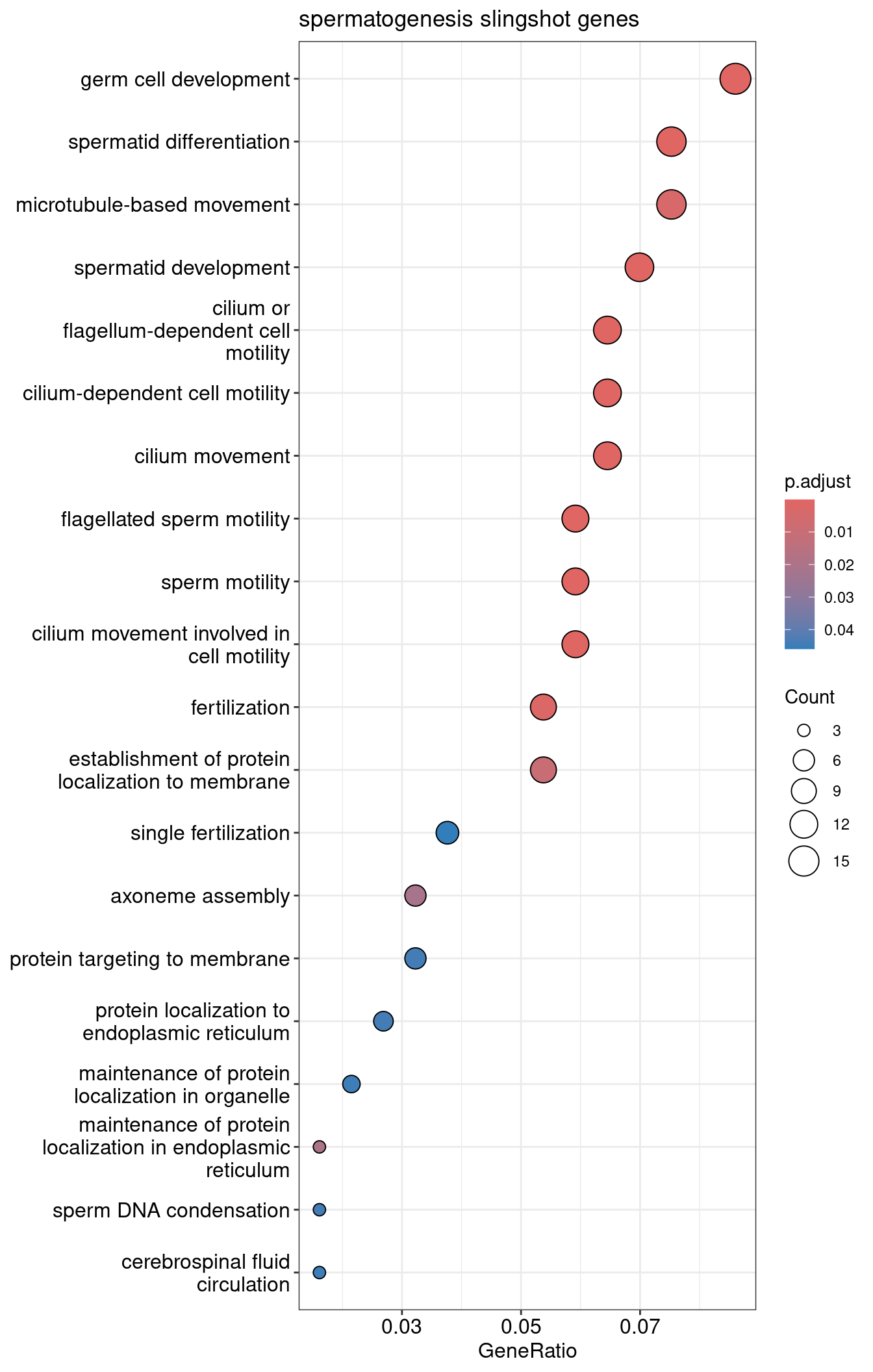
| GO:0048515 | GO:0048515 | spermatid differentiation | 14/186 | 286/23040 | 0.0489510 | 6.063614 | 7.773595 | 1e-07 | 0.0000795 | 0.0000759 | 14 |
| GO:0001539 | GO:0001539 | cilium or flagellum-dependent cell motility | 12/186 | 207/23040 | 0.0579710 | 7.180926 | 8.058689 | 1e-07 | 0.0000795 | 0.0000759 | 12 |
| GO:0060285 | GO:0060285 | cilium-dependent cell motility | 12/186 | 207/23040 | 0.0579710 | 7.180926 | 8.058689 | 1e-07 | 0.0000795 | 0.0000759 | 12 |
| GO:0030317 | GO:0030317 | flagellated sperm motility | 11/186 | 177/23040 | 0.0621469 | 7.698196 | 8.070214 | 2e-07 | 0.0001005 | 0.0000959 | 11 |
| GO:0097722 | GO:0097722 | sperm motility | 11/186 | 185/23040 | 0.0594595 | 7.365301 | 7.841901 | 3e-07 | 0.0001244 | 0.0001188 | 11 |
| GO:0007286 | GO:0007286 | spermatid development | 13/186 | 275/23040 | 0.0472727 | 5.855719 | 7.307910 | 4e-07 | 0.0001244 | 0.0001188 | 13 |
dotplot
1dotplot(slingshot.spermatogenesis.ORA, showCategory=30) + ggtitle("spermatogenesis slingshot genes")
tree plot
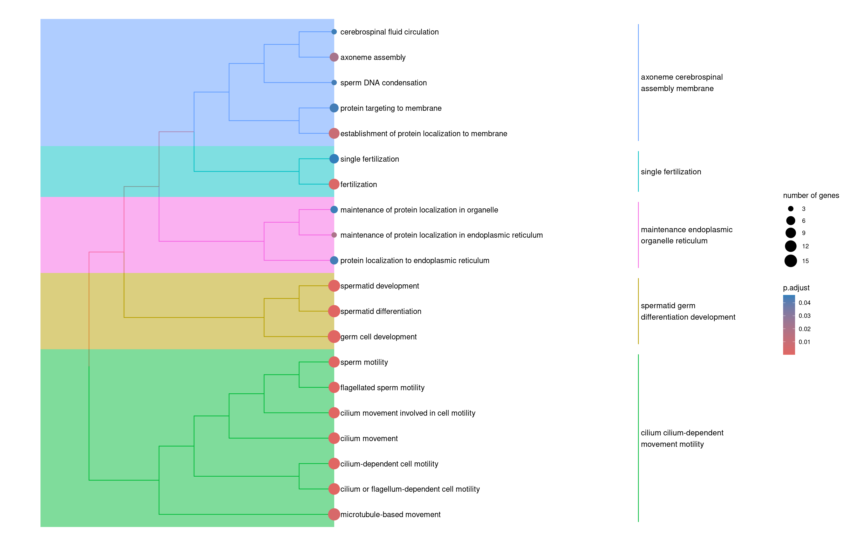
1slingshot.spermatogenesis.ORA2 <- enrichplot::pairwise_termsim(slingshot.spermatogenesis.ORA)
2enrichplot::treeplot(slingshot.spermatogenesis.ORA2)
Velocity genes
1velocity.spermatogenesis.ORA.genes <- spermatogenesis.genes.df %>%
2    head( gene.num  ) %>%
3    pull(gene)
Enrichment analysis
 1velocity.spermatogenesis.ORA <- enrichGO(
 2  gene          = velocity.spermatogenesis.ORA.genes,
 3  OrgDb         = org.Mm.eg.db,
 4  keyType       = "ENSEMBL",
 5  ont           = "BP",
 6  pAdjustMethod = "BH",
 7  pvalueCutoff  = 0.05,
 8  qvalueCutoff  = 0.05,
 9  readable      = TRUE
10)
check results
1knitr::kable(velocity.spermatogenesis.ORA %>%
2               as.data.frame() %>%
3               dplyr::select(-geneID) %>%
4               head(),
5             align = "c")
| ID | Description | GeneRatio | BgRatio | RichFactor | FoldEnrichment | zScore | pvalue | p.adjust | qvalue | Count | |
|---|---|---|---|---|---|---|---|---|---|---|---|
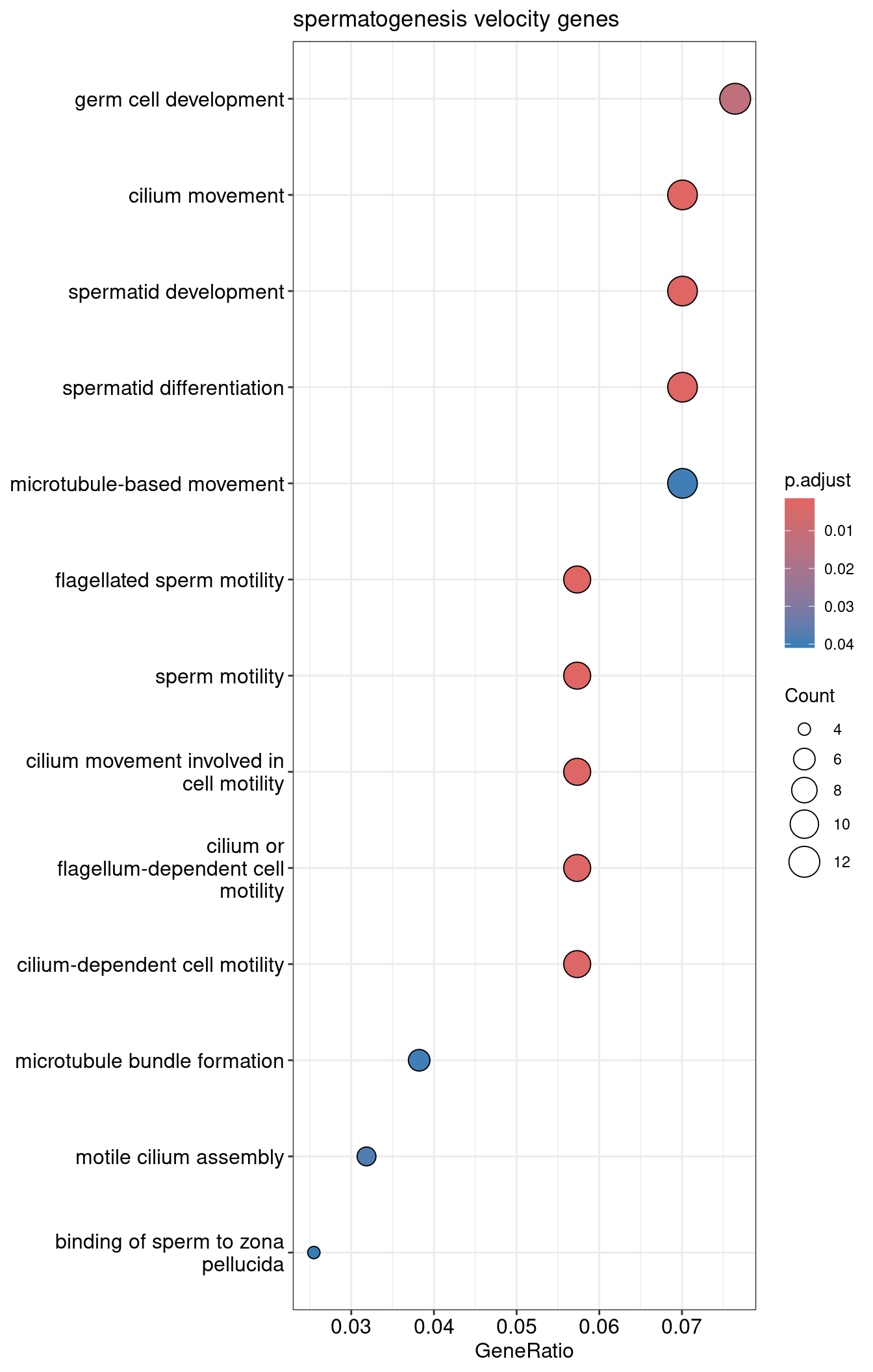
| GO:0003341 | GO:0003341 | cilium movement | 11/157 | 244/23040 | 0.0450820 | 6.615850 | 7.304766 | 1.00e-06 | 0.0014823 | 0.0014823 | 11 |
| GO:0007286 | GO:0007286 | spermatid development | 11/157 | 275/23040 | 0.0400000 | 5.870064 | 6.729647 | 3.10e-06 | 0.0016003 | 0.0016003 | 11 |
| GO:0030317 | GO:0030317 | flagellated sperm motility | 9/157 | 177/23040 | 0.0508475 | 7.461945 | 7.148394 | 3.60e-06 | 0.0016003 | 0.0016003 | 9 |
| GO:0048515 | GO:0048515 | spermatid differentiation | 11/157 | 286/23040 | 0.0384615 | 5.644292 | 6.546344 | 4.50e-06 | 0.0016003 | 0.0016003 | 11 |
| GO:0097722 | GO:0097722 | sperm motility | 9/157 | 185/23040 | 0.0486486 | 7.139267 | 6.944435 | 5.20e-06 | 0.0016003 | 0.0016003 | 9 |
| GO:0060294 | GO:0060294 | cilium movement involved in cell motility | 9/157 | 201/23040 | 0.0447761 | 6.570967 | 6.570754 | 1.02e-05 | 0.0024738 | 0.0024738 | 9 |
dotplot
1dotplot(velocity.spermatogenesis.ORA, showCategory=30) + ggtitle("spermatogenesis velocity genes")
tree plot
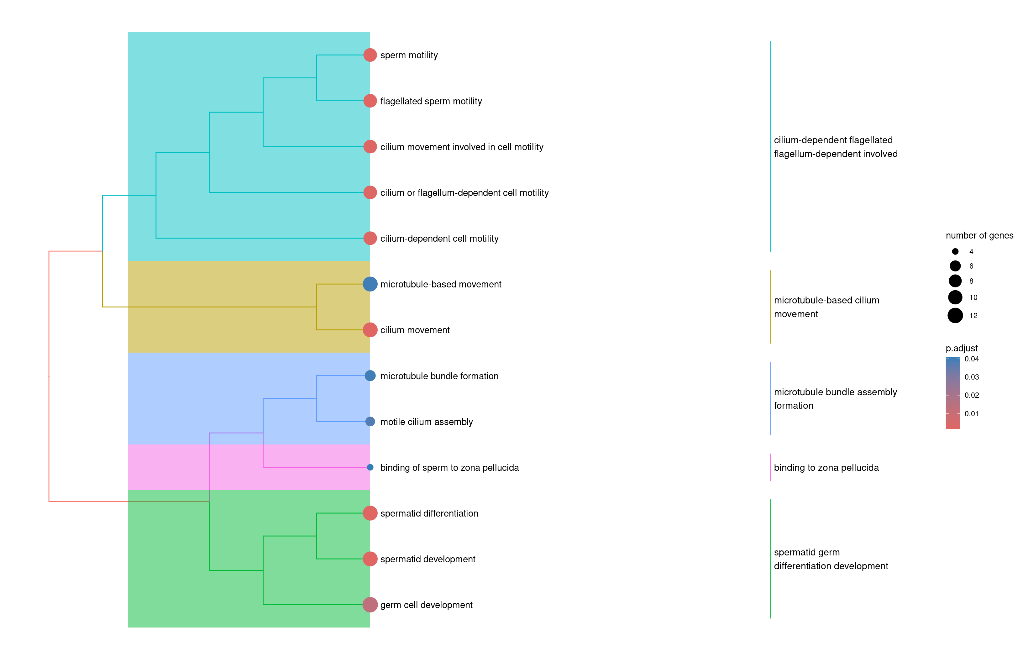
1velocity.spermatogenesis.ORA2 <- enrichplot::pairwise_termsim(velocity.spermatogenesis.ORA)
2enrichplot::treeplot(velocity.spermatogenesis.ORA2)
Venn diagram of GO enrichment results
 1dataset <- 'spermatogenesis.GO'
 2venn.diagram( list( slingshot = slingshot.spermatogenesis.ORA %>%
 3                                   as.data.frame() %>%
 4                                   pull(Description ),
 5                    velocity = velocity.spermatogenesis.ORA %>%
 6                                 as.data.frame() %>%
 7                                 pull(Description )
 8                  ),
 9              paste0(dataset, "Venn.diagram.tiff"),
10              fill=wes_palette("FantasticFox1")[1:length(namedGenesList)],
11              alpha=rep( 0.25, length(namedGenesList) ),
12              cex = 2.5, cat.fontface=4,
13              category.names = names(namedGenesList),
14              col=wes_palette("FantasticFox1")[1:length(namedGenesList)]
15            )
## [1] 1
1log.files <- list.files('.', pattern = "*Venn.diagram.*.log", full.names = T)
2file.remove(log.files)
## [1] TRUE
1cmd <- paste0( 'convert ', dataset, 'Venn.diagram.tiff ', dataset, 'Venn.diagram.png && rm ', dataset, 'Venn.diagram.tiff ' )
2system( cmd )

Here the number of common GOs is surprisingly high. This is probably due to the fact that the genes are not the same but they are related to similar processes.
Conclusions
- Slingshot pseudotime, latent time and velocity pseudotime are well correlated indicating that, at least for datasets from clear differentiation processes, both methods agree.
- For these examples, latent time and velocity pseudotime and positively correlated but I have seen examples where they are negatively correlated suggestion caution assuming both methods always agree.
- Eventhough the relevant genes for both methods are not the same, the functional enrichment analysis shows that they are related to similar processes. This is a good indication that both methods are capturing the same biological process.
Take away
The analysis presented here is only the tip of the iceberg as discussed below.
- I used a fast approach to find the genes changing along pseudotime trajectories but there are many sophisticated methods to characterize trajectories in multiple ways. Here some of them:
- scVelo also offers more approaches to find relevant genes, such as:
- scVelo, or the original velocyto approach, are not the only methods to calculate RNA velocity:
- We have even tools to combine cell trajectory and RNA velocity to study cell fate: CellRank2