Single Cell Dimensional Reduction: Phate
Following my previous post on t-SNE vs UMAP, I will now check another dimensional reduction technique, PHATE (Potential of Heat-diffusion for Affinity-based Transition Embedding). According to the authors PHATE is a visualization method that captures both local and global nonlinear structure using an information-geometric distance between data points.
For this test I will compare PHATE vs UMAP using two of the datasets used in the tutorials, embriod body differentiation & bone marrow, plus the pancreas dataset used in the pseudotime trajectory and RNA velocity posts.
PHATE is implemented in Python and R (and MATLAB!). However, the R implementation uses reticulate to access the Python package so I will directly use the Python implementation. I run the code in Jupyter Notebook to work in a more interactive environment.
Embriod Body differentiation
The Embriod Body (EB) dataset is publically available as scRNAseq.zip at Mendelay Datasets at https://data.mendeley.com/datasets/v6n743h5ng/. This analysis is partially based on the PHATE tutorial
import packages
1import os
2import scprep
3import pandas as pd
4import numpy as np
5import phate
import data using scprep
1sparse=True
2T1 = scprep.io.load_10X(os.path.join("scRNAseq", "T0_1A"), sparse=sparse, gene_labels='both')
3T2 = scprep.io.load_10X(os.path.join("scRNAseq", "T2_3B"), sparse=sparse, gene_labels='both')
4T3 = scprep.io.load_10X(os.path.join("scRNAseq", "T4_5C"), sparse=sparse, gene_labels='both')
5T4 = scprep.io.load_10X(os.path.join("scRNAseq", "T6_7D"), sparse=sparse, gene_labels='both')
6T5 = scprep.io.load_10X(os.path.join("scRNAseq", "T8_9E"), sparse=sparse, gene_labels='both')
check the data
1T1
| RP11-34P13.3 (ENSG00000243485) | FAM138A (ENSG00000237613) | OR4F5 (ENSG00000186092) | RP11-34P13.7 (ENSG00000238009) | RP11-34P13.8 (ENSG00000239945) | RP11-34P13.14 (ENSG00000239906) | RP11-34P13.9 (ENSG00000241599) | FO538757.3 (ENSG00000279928) | FO538757.2 (ENSG00000279457) | AP006222.2 (ENSG00000228463) | ... | AC007325.2 (ENSG00000277196) | BX072566.1 (ENSG00000277630) | AL354822.1 (ENSG00000278384) | AC023491.2 (ENSG00000278633) | AC004556.1 (ENSG00000276345) | AC233755.2 (ENSG00000277856) | AC233755.1 (ENSG00000275063) | AC240274.1 (ENSG00000271254) | AC213203.1 (ENSG00000277475) | FAM231B (ENSG00000268674) | |
|---|---|---|---|---|---|---|---|---|---|---|---|---|---|---|---|---|---|---|---|---|---|
| 0 | |||||||||||||||||||||
| AAACATACCAGAGG-1 | 0.0 | 0.0 | 0.0 | 0.0 | 0.0 | 0.0 | 0.0 | 0.0 | 1.0 | 0.0 | ... | 0.0 | 0.0 | 0.0 | 0.0 | 0.0 | 0.0 | 0.0 | 0.0 | 0.0 | 0.0 |
| AAACATTGAAAGCA-1 | 0.0 | 0.0 | 0.0 | 0.0 | 0.0 | 0.0 | 0.0 | 0.0 | 0.0 | 0.0 | ... | 0.0 | 0.0 | 0.0 | 0.0 | 0.0 | 0.0 | 0.0 | 0.0 | 0.0 | 0.0 |
| AAACATTGAAGTGA-1 | 0.0 | 0.0 | 0.0 | 0.0 | 0.0 | 0.0 | 0.0 | 0.0 | 0.0 | 0.0 | ... | 0.0 | 0.0 | 0.0 | 0.0 | 0.0 | 0.0 | 0.0 | 0.0 | 0.0 | 0.0 |
| AAACATTGGAGGTG-1 | 0.0 | 0.0 | 0.0 | 0.0 | 0.0 | 0.0 | 0.0 | 0.0 | 0.0 | 0.0 | ... | 0.0 | 0.0 | 0.0 | 0.0 | 0.0 | 0.0 | 0.0 | 0.0 | 0.0 | 0.0 |
| AAACATTGGTTTCT-1 | 0.0 | 0.0 | 0.0 | 0.0 | 0.0 | 0.0 | 0.0 | 0.0 | 0.0 | 0.0 | ... | 0.0 | 0.0 | 0.0 | 0.0 | 0.0 | 0.0 | 0.0 | 0.0 | 0.0 | 0.0 |
| ... | ... | ... | ... | ... | ... | ... | ... | ... | ... | ... | ... | ... | ... | ... | ... | ... | ... | ... | ... | ... | ... |
| TTTGACTGCTTCTA-1 | 0.0 | 0.0 | 0.0 | 0.0 | 0.0 | 0.0 | 0.0 | 0.0 | 0.0 | 0.0 | ... | 0.0 | 0.0 | 0.0 | 0.0 | 0.0 | 0.0 | 0.0 | 0.0 | 0.0 | 0.0 |
| TTTGACTGTGCCCT-1 | 0.0 | 0.0 | 0.0 | 0.0 | 0.0 | 0.0 | 0.0 | 0.0 | 0.0 | 0.0 | ... | 0.0 | 0.0 | 0.0 | 0.0 | 0.0 | 0.0 | 0.0 | 0.0 | 0.0 | 0.0 |
| TTTGCATGAGGTCT-1 | 0.0 | 0.0 | 0.0 | 0.0 | 0.0 | 0.0 | 0.0 | 0.0 | 0.0 | 0.0 | ... | 0.0 | 0.0 | 0.0 | 0.0 | 0.0 | 0.0 | 0.0 | 0.0 | 0.0 | 0.0 |
| TTTGCATGGGCGAA-1 | 0.0 | 0.0 | 0.0 | 0.0 | 0.0 | 0.0 | 0.0 | 0.0 | 0.0 | 0.0 | ... | 0.0 | 0.0 | 0.0 | 0.0 | 0.0 | 0.0 | 0.0 | 0.0 | 0.0 | 0.0 |
| TTTGCATGTGACAC-1 | 0.0 | 0.0 | 0.0 | 0.0 | 0.0 | 0.0 | 0.0 | 0.0 | 0.0 | 1.0 | ... | 0.0 | 0.0 | 0.0 | 0.0 | 0.0 | 0.0 | 0.0 | 0.0 | 0.0 | 0.0 |
4649 rows × 33694 columns
perform preprocessing as described in the Phate tutorial
1filtered_batches = []
2for batch in [T1, T2, T3, T4, T5]:
3    batch = scprep.filter.filter_library_size(batch, percentile=20, keep_cells='above')
4    batch = scprep.filter.filter_library_size(batch, percentile=75, keep_cells='below')
5    filtered_batches.append(batch)
6del T1, T2, T3, T4, T5 # removes objects from memory
Merge all datasets and create a vector representing the time point of each sample
1EBT_counts, sample_labels = scprep.utils.combine_batches(
2    filtered_batches,
3    ["Day 00-03", "Day 06-09", "Day 12-15", "Day 18-21", "Day 24-27"],
4    append_to_cell_names=True
5)
6del filtered_batches # removes objects from memory
7EBT_counts
| A1BG (ENSG00000121410) | A1BG-AS1 (ENSG00000268895) | A1CF (ENSG00000148584) | A2M (ENSG00000175899) | A2M-AS1 (ENSG00000245105) | A2ML1 (ENSG00000166535) | A2ML1-AS1 (ENSG00000256661) | A2ML1-AS2 (ENSG00000256904) | A3GALT2 (ENSG00000184389) | A4GALT (ENSG00000128274) | ... | ZXDC (ENSG00000070476) | ZYG11A (ENSG00000203995) | ZYG11B (ENSG00000162378) | ZYX (ENSG00000159840) | ZZEF1 (ENSG00000074755) | ZZZ3 (ENSG00000036549) | bP-21264C1.2 (ENSG00000278932) | bP-2171C21.3 (ENSG00000279501) | bP-2189O9.3 (ENSG00000279579) | hsa-mir-1253 (ENSG00000272920) | |
|---|---|---|---|---|---|---|---|---|---|---|---|---|---|---|---|---|---|---|---|---|---|
| AAACATTGAAAGCA-1_Day 00-03 | 0.0 | 0.0 | 0.0 | 0.0 | 0.0 | 0.0 | 0.0 | 0.0 | 0.0 | 0.0 | ... | 0.0 | 0.0 | 0.0 | 0.0 | 0.0 | 0.0 | 0.0 | 0.0 | 0.0 | 0.0 |
| AAACCGTGCAGAAA-1_Day 00-03 | 0.0 | 0.0 | 0.0 | 0.0 | 0.0 | 0.0 | 0.0 | 0.0 | 0.0 | 0.0 | ... | 0.0 | 0.0 | 0.0 | 0.0 | 0.0 | 0.0 | 0.0 | 0.0 | 0.0 | 0.0 |
| AAACCGTGGAAGGC-1_Day 00-03 | 0.0 | 0.0 | 0.0 | 0.0 | 0.0 | 0.0 | 0.0 | 0.0 | 0.0 | 0.0 | ... | 0.0 | 0.0 | 0.0 | 0.0 | 0.0 | 0.0 | 0.0 | 0.0 | 0.0 | 0.0 |
| AAACGCACCGGTAT-1_Day 00-03 | 0.0 | 0.0 | 0.0 | 0.0 | 0.0 | 0.0 | 0.0 | 0.0 | 0.0 | 0.0 | ... | 0.0 | 0.0 | 0.0 | 0.0 | 0.0 | 0.0 | 0.0 | 0.0 | 0.0 | 0.0 |
| AAACGCACCTATTC-1_Day 00-03 | 0.0 | 0.0 | 0.0 | 0.0 | 0.0 | 0.0 | 0.0 | 0.0 | 0.0 | 0.0 | ... | 0.0 | 0.0 | 0.0 | 1.0 | 0.0 | 0.0 | 0.0 | 0.0 | 0.0 | 0.0 |
| ... | ... | ... | ... | ... | ... | ... | ... | ... | ... | ... | ... | ... | ... | ... | ... | ... | ... | ... | ... | ... | ... |
| TTTCTACTCTTATC-1_Day 24-27 | 0.0 | 0.0 | 0.0 | 0.0 | 0.0 | 0.0 | 0.0 | 0.0 | 0.0 | 0.0 | ... | 0.0 | 0.0 | 0.0 | 0.0 | 0.0 | 0.0 | 0.0 | 0.0 | 0.0 | 0.0 |
| TTTCTACTTGAGCT-1_Day 24-27 | 1.0 | 0.0 | 0.0 | 0.0 | 0.0 | 0.0 | 0.0 | 0.0 | 0.0 | 0.0 | ... | 0.0 | 0.0 | 0.0 | 0.0 | 0.0 | 0.0 | 0.0 | 0.0 | 0.0 | 0.0 |
| TTTGCATGATGACC-1_Day 24-27 | 0.0 | 0.0 | 0.0 | 0.0 | 0.0 | 0.0 | 0.0 | 0.0 | 0.0 | 0.0 | ... | 0.0 | 0.0 | 0.0 | 0.0 | 0.0 | 0.0 | 0.0 | 0.0 | 0.0 | 0.0 |
| TTTGCATGCACTCC-1_Day 24-27 | 0.0 | 0.0 | 0.0 | 0.0 | 0.0 | 0.0 | 0.0 | 0.0 | 0.0 | 0.0 | ... | 0.0 | 0.0 | 0.0 | 0.0 | 0.0 | 0.0 | 0.0 | 0.0 | 0.0 | 0.0 |
| TTTGCATGTTCTTG-1_Day 24-27 | 0.0 | 0.0 | 0.0 | 0.0 | 1.0 | 0.0 | 0.0 | 0.0 | 0.0 | 0.0 | ... | 0.0 | 0.0 | 0.0 | 0.0 | 0.0 | 0.0 | 0.0 | 0.0 | 0.0 | 0.0 |
18691 rows × 33694 columns
Eliminate genes that are expressed in 10 cells or fewer & correct for differences in library sizes. Check mitocondrial content.
1EBT_counts = scprep.filter.filter_rare_genes(EBT_counts, min_cells=10)
2EBT_counts = scprep.normalize.library_size_normalize(EBT_counts)
3mito_genes = scprep.select.get_gene_set(EBT_counts, starts_with="MT-") # Get all mitochondrial genes. There are 14, FYI.
4scprep.plot.plot_gene_set_expression(EBT_counts, genes=mito_genes, percentile=90)
/home/alfonso/.virtualenvs/phate/lib/python3.10/site-packages/scprep/plot/utils.py:104: UserWarning: FigureCanvasAgg is non-interactive, and thus cannot be shown
  fig.show()


<Axes: xlabel='Gene expression', ylabel='Number of cells'>
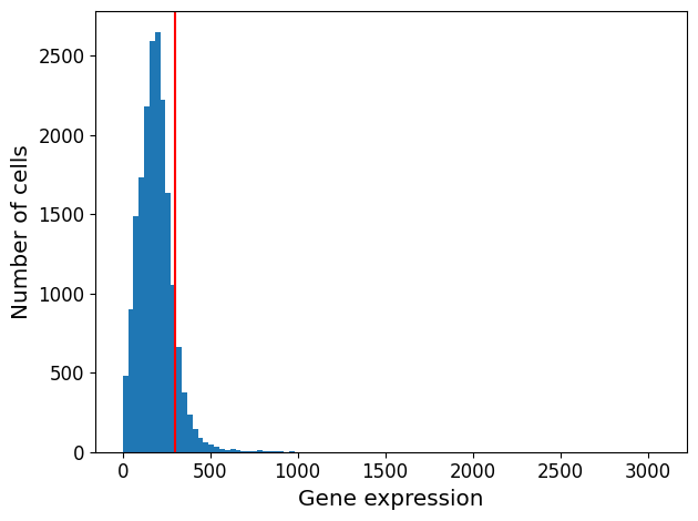
Remove cells with the highest mitochondrial RNA expression levels.
1EBT_counts, sample_labels = scprep.filter.filter_gene_set_expression(
2    EBT_counts, sample_labels, genes=mito_genes,
3    percentile=90, keep_cells='below')
The tutorial says they use sqrt transformation to avoid adding pseudo-counts during log transformation.
1EBT_counts_sqrt = scprep.transform.sqrt(EBT_counts)
Apply Phate, here are the parameters:
- knn : Number of nearest neighbors (default: 5). Increase this (e.g. to 20) if your PHATE embedding appears very disconnected. You should also consider increasing knn if your dataset is extremely large (e.g. >100k cells)
- decay : Alpha decay (default: 15). Decreasing decay increases connectivity on the graph, increasing decay decreases connectivity. This rarely needs to be tuned. Set it to None for a k-nearest neighbors kernel.
- t : Number of times to power the operator (default: 'auto'). This is equivalent to the amount of smoothing done to the data. It is chosen automatically by default, but you can increase it if your embedding lacks structure, or decrease it if the structure looks too compact.
- gamma : Informational distance constant (default: 1). gamma=1 gives the PHATE log potential, but other informational distances can be interesting. If most of the points seem concentrated in one section of the plot, you can try gamma=0.
1phate_operator = phate.PHATE(n_jobs=-2)
2Y_phate = phate_operator.fit_transform(EBT_counts_sqrt)
Calculating PHATE...
  Running PHATE on 16821 observations and 17845 variables.
  Calculating graph and diffusion operator...
    Calculating PCA...
    Calculated PCA in 16.54 seconds.
    Calculating KNN search...
    Calculated KNN search in 7.71 seconds.
    Calculating affinities...
    Calculated affinities in 0.56 seconds.
  Calculated graph and diffusion operator in 25.53 seconds.
  Calculating landmark operator...
    Calculating SVD...
    Calculated SVD in 0.80 seconds.
    Calculating KMeans...
    Calculated KMeans in 2.48 seconds.
  Calculated landmark operator in 3.99 seconds.
  Calculating optimal t...
    Automatically selected t = 19
  Calculated optimal t in 1.60 seconds.
  Calculating diffusion potential...
  Calculated diffusion potential in 0.44 seconds.
  Calculating metric MDS...
  Calculated metric MDS in 3.47 seconds.
Calculated PHATE in 35.05 seconds.
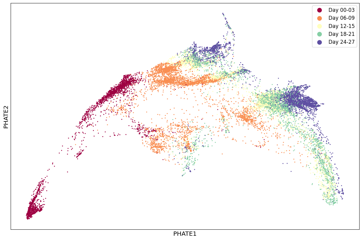
plot results
1scprep.plot.scatter2d(Y_phate, c=sample_labels, figsize=(12,8), cmap="Spectral",
2                      ticks=False, label_prefix="PHATE")
/home/alfonso/.virtualenvs/phate/lib/python3.10/site-packages/scprep/plot/utils.py:104: UserWarning: FigureCanvasAgg is non-interactive, and thus cannot be shown
  fig.show()


<Axes: xlabel='PHATE1', ylabel='PHATE2'>
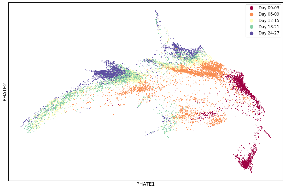
Adjust parameters to the expected sparsity of the trajectories.
1phate_operator.set_params(knn=4, decay=15, t=12)
2# We could also create a new operator:
3# phate_operator = phate.PHATE(knn=4, decay=15, t=12, n_jobs=-2)
4
5Y_phate = phate_operator.fit_transform(EBT_counts_sqrt)
Calculating PHATE...
  Running PHATE on 16821 observations and 17845 variables.
  Calculating graph and diffusion operator...
    Calculating PCA...
    Calculated PCA in 15.63 seconds.
    Calculating KNN search...
    Calculated KNN search in 7.79 seconds.
    Calculating affinities...
    Calculated affinities in 9.19 seconds.
  Calculated graph and diffusion operator in 33.02 seconds.
  Calculating landmark operator...
    Calculating SVD...
    Calculated SVD in 2.34 seconds.
    Calculating KMeans...
    Calculated KMeans in 2.41 seconds.
  Calculated landmark operator in 5.66 seconds.
  Calculating diffusion potential...
  Calculated diffusion potential in 0.24 seconds.
  Calculating metric MDS...
  Calculated metric MDS in 3.72 seconds.
Calculated PHATE in 42.64 seconds.
1scprep.plot.scatter2d(Y_phate, c=sample_labels, figsize=(12,8), cmap="Spectral",
2                      ticks=False, label_prefix="PHATE")
/home/alfonso/.virtualenvs/phate/lib/python3.10/site-packages/scprep/plot/utils.py:104: UserWarning: FigureCanvasAgg is non-interactive, and thus cannot be shown
  fig.show()


<Axes: xlabel='PHATE1', ylabel='PHATE2'>
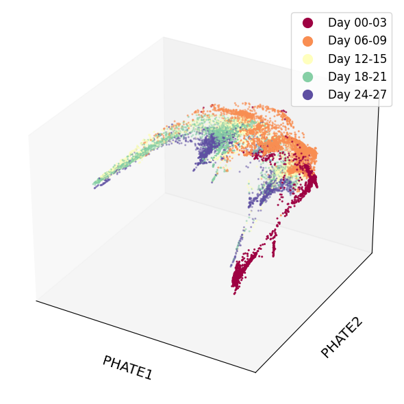
Let's see the results in 3D
1phate_operator.set_params(n_components=3)
PHATE(decay=15, knn=4, n_components=3, n_jobs=-2, t=12)In a Jupyter environment, please rerun this cell to show the HTML representation or trust the notebook.
On GitHub, the HTML representation is unable to render, please try loading this page with nbviewer.org.
PHATE(decay=15, knn=4, n_components=3, n_jobs=-2, t=12)
1Y_phate_3d = phate_operator.transform()
Calculating metric MDS...
Calculated metric MDS in 33.38 seconds.
1scprep.plot.scatter3d(Y_phate_3d, c=sample_labels, figsize=(8,6), cmap="Spectral",
2                      ticks=False, label_prefix="PHATE")
/home/alfonso/.virtualenvs/phate/lib/python3.10/site-packages/scprep/plot/utils.py:104: UserWarning: FigureCanvasAgg is non-interactive, and thus cannot be shown
  fig.show()


<Axes3D: xlabel='PHATE1', ylabel='PHATE2', zlabel='PHATE3'>
let's create an interactive 3D plot using Plotly
1import numpy as np
2import plotly.express as px
3import plotly.colors
4import pandas as pd
5import plotly.io as pio
6pio.renderers.default = 'notebook'
Create a DataFrame for plotting
1df = pd.DataFrame(Y_phate_3d, columns=['x', 'y', 'z'])
2df['label'] = sample_labels.values
3df
| x | y | z | label | |
|---|---|---|---|---|
| 0 | 0.020654 | -0.000396 | -0.000804 | Day 00-03 |
| 1 | 0.018222 | -0.035808 | -0.012899 | Day 00-03 |
| 2 | 0.020209 | -0.036790 | -0.011559 | Day 00-03 |
| 3 | 0.020340 | 0.001434 | -0.003939 | Day 00-03 |
| 4 | 0.019314 | -0.038632 | -0.014137 | Day 00-03 |
| ... | ... | ... | ... | ... |
| 16816 | -0.015878 | 0.003464 | -0.005035 | Day 24-27 |
| 16817 | -0.013085 | 0.005707 | 0.001802 | Day 24-27 |
| 16818 | -0.017589 | 0.001709 | -0.005155 | Day 24-27 |
| 16819 | -0.017692 | 0.001643 | -0.005955 | Day 24-27 |
| 16820 | -0.015194 | 0.004656 | -0.003109 | Day 24-27 |
16821 rows × 4 columns
now the plot
 1custom_color_map = {
 2    'Day 00-03': '#9e0142',
 3    'Day 06-09': '#f46d43',
 4    'Day 12-15': '#fdfd9a',
 5    'Day 18-21': '#66c2a5',
 6    'Day 24-27': '#5e4fa2'
 7}
 8
 9fig = px.scatter_3d(
10    df,
11    x='x',
12    y='y',
13    z='z',
14    color='label',
15    color_discrete_map=custom_color_map
16)
17
18fig.update_traces(marker=dict(size=1))
19
20fig.update_layout(
21    legend=dict(
22        itemsizing='constant',
23        font=dict(size=12)
24    ),
25    scene=dict(
26        xaxis=dict(
27            title='PHATE 1',
28            showticklabels=False,
29            showline=True,
30            zeroline=False,
31            linecolor='black',
32            backgroundcolor='rgba(0,0,0,0)',
33            gridcolor='lightgrey',
34            showgrid=True
35        ),
36        yaxis=dict(
37            title='PHATE 2',
38            showticklabels=False,
39            showline=True,
40            zeroline=False,
41            linecolor='black',
42            backgroundcolor='rgba(0,0,0,0)',
43            gridcolor='lightgrey',
44            showgrid=True
45        ),
46        zaxis=dict(
47            title='PHATE 3',
48            showticklabels=False,
49            showline=True,
50            zeroline=False,
51            linecolor='black',
52            backgroundcolor='rgba(0,0,0,0)',
53            gridcolor='lightgrey',
54            showgrid=True
55        )
56    )
57)
58fig.write_html("../../../static/images/plot1.html", include_plotlyjs="embed")
The only drawback of working with Jupyter notebook is that when I import the notebook to markdown to publish this blog, the interactive plots are not rendered. So I will save the plots as HTML files and link them here. Click here to view the interactive plot
generate UMAP with scanpy
1import anndata as ad
2import scipy.sparse as sp
3import scanpy as sc
1isinstance(sample_labels, pd.DataFrame)
False
start from the same counts before transforming with sqrt
1bdata = ad.AnnData(
2    X=sp.csr_matrix(EBT_counts.values),
3    obs=pd.DataFrame({'sample':sample_labels.values})
4)
/home/alfonso/.virtualenvs/phate/lib/python3.10/site-packages/anndata/_core/aligned_df.py:68: ImplicitModificationWarning:

Transforming to str index.
1bdata.layers["counts"] = bdata.X.copy()
2# Normalizing to median total counts
3# sc.pp.normalize_total(bdata)
4# Logarithmize the data
5sc.pp.log1p(bdata)
1sc.pp.highly_variable_genes(bdata, n_top_genes=2000, batch_key="sample")
/home/alfonso/.virtualenvs/phate/lib/python3.10/site-packages/numba/np/ufunc/parallel.py:371: NumbaWarning:

The TBB threading layer requires TBB version 2021 update 6 or later i.e., TBB_INTERFACE_VERSION >= 12060. Found TBB_INTERFACE_VERSION = 12050. The TBB threading layer is disabled.
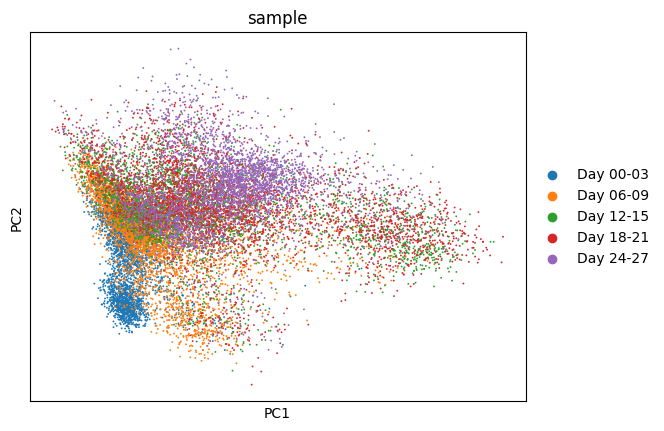
1sc.tl.pca(bdata)
1sc.pl.pca(
2    bdata,
3    color="sample"
4)
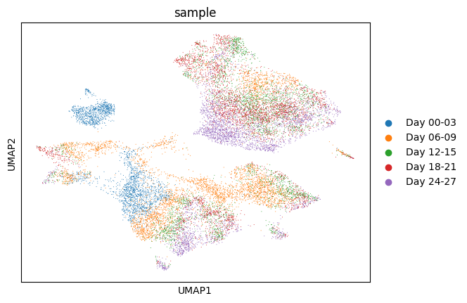
1sc.pp.neighbors(bdata)
2sc.tl.umap(bdata)
3sc.pl.umap(
4    bdata,
5    color="sample",
6    size=2,
7)
/home/alfonso/.virtualenvs/phate/lib/python3.10/site-packages/tqdm/auto.py:21: TqdmWarning:

IProgress not found. Please update jupyter and ipywidgets. See https://ipywidgets.readthedocs.io/en/stable/user_install.html
1sc.tl.umap(bdata, n_components=3, key_added='UMAP_3D')
1df2 = pd.DataFrame(bdata.obsm['UMAP_3D'], columns=['x', 'y', 'z'])
2df2['label'] = bdata.obs['sample'].values
 1# Create the 3D scatter plot
 2fig = px.scatter_3d(
 3    df2,
 4    x='x',
 5    y='y',
 6    z='z',
 7    color='label',
 8    color_discrete_map=custom_color_map
 9)
10
11fig.update_traces(marker=dict(size=1))
12
13fig.update_layout(
14    legend=dict(
15        itemsizing='constant',
16        font=dict(size=12)
17    ),
18    scene=dict(
19        xaxis=dict(
20            title='UMAP 1',
21            showticklabels=False,
22            showline=True,
23            zeroline=False,
24            linecolor='black',
25            backgroundcolor='rgba(0,0,0,0)',
26            gridcolor='lightgrey',
27            showgrid=True
28        ),
29        yaxis=dict(
30            title='UMAP 2',
31            showticklabels=False,
32            showline=True,
33            zeroline=False,
34            linecolor='black',
35            backgroundcolor='rgba(0,0,0,0)',
36            gridcolor='lightgrey',
37            showgrid=True
38        ),
39        zaxis=dict(
40            title='UMAP 3',
41            showticklabels=False,
42            showline=True,
43            zeroline=False,
44            linecolor='black',
45            backgroundcolor='rgba(0,0,0,0)',
46            gridcolor='lightgrey',
47            showgrid=True
48        )
49    )
50)
51
52fig.write_html("../../../static/images/plot2.html", include_plotlyjs="embed")
Click here to view the interactive plot
now with sqrt transformed data
1ddata = ad.AnnData(
2    X=sp.csr_matrix(EBT_counts_sqrt.values),
3    obs=pd.DataFrame({'sample':sample_labels.values})
4)
/home/alfonso/.virtualenvs/phate/lib/python3.10/site-packages/anndata/_core/aligned_df.py:68: ImplicitModificationWarning:

Transforming to str index.
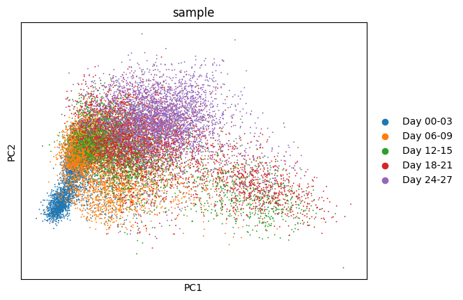
1sc.pp.highly_variable_genes(ddata, n_top_genes=2000, batch_key="sample")
2sc.tl.pca(ddata)
3sc.pl.pca(
4    ddata,
5    color="sample"
6)
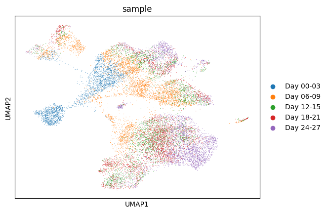
1sc.pp.neighbors(ddata)
2sc.tl.umap(ddata)
3sc.pl.umap(
4    ddata,
5    color="sample",
6    size=2,
7)
 1sc.tl.umap(ddata, n_components=3, key_added='UMAP_3D')
 2
 3df5 = pd.DataFrame(bdata.obsm['UMAP_3D'], columns=['x', 'y', 'z'])
 4df5['label'] = bdata.obs['sample'].values
 5
 6fig = px.scatter_3d(
 7    df5,
 8    x='x',
 9    y='y',
10    z='z',
11    color='label',
12    color_discrete_map=custom_color_map
13)
14
15fig.update_traces(marker=dict(size=1))
16
17fig.update_layout(
18    legend=dict(
19        itemsizing='constant',
20        font=dict(size=12)
21    ),
22    scene=dict(
23        xaxis=dict(
24            title='UMAP 1',
25            showticklabels=False,
26            showline=True,
27            zeroline=False,
28            linecolor='black',
29            backgroundcolor='rgba(0,0,0,0)',
30            gridcolor='lightgrey',
31            showgrid=True
32        ),
33        yaxis=dict(
34            title='UMAP 2',
35            showticklabels=False,
36            showline=True,
37            zeroline=False,
38            linecolor='black',
39            backgroundcolor='rgba(0,0,0,0)',
40            gridcolor='lightgrey',
41            showgrid=True
42        ),
43        zaxis=dict(
44            title='UMAP 3',
45            showticklabels=False,
46            showline=True,
47            zeroline=False,
48            linecolor='black',
49            backgroundcolor='rgba(0,0,0,0)',
50            gridcolor='lightgrey',
51            showgrid=True
52        )
53    )
54)
55fig.write_html("../../../static/images/plot3.html", include_plotlyjs="embed")
Click here to view the interactive plot
The shape of the PHATE and UMAP plots are very different. However, when we look at the relationship among the different cell types the biological conclusions would be similar. Specially in the 3D versions.
There is no clear difference between the sqrt transformed and the log transformed data for the UMAP embeddings.
Bone Marrow
For the bone marrow dataset, I adapted this R tutorial and manually downloaded the BMMC myeloid dataset.
Load and check the data
1file.gz = "BMMC_myeloid.csv.gz"
2bmmsc = pd.read_csv(file.gz, compression='gzip', index_col=0)
3bmmsc
| 0610007C21Rik;Apr3 | 0610007L01Rik | 0610007P08Rik;Rad26l | 0610007P14Rik | 0610007P22Rik | 0610008F07Rik | 0610009B22Rik | 0610009D07Rik | 0610009O20Rik | 0610010B08Rik;Gm14434;Gm14308 | ... | mTPK1;Tpk1 | mimp3;Igf2bp3;AK045244 | mszf84;Gm14288;Gm14435;Gm8898 | mt-Nd4 | mt3-mmp;Mmp16 | rp9 | scmh1;Scmh1 | slc43a2;Slc43a2 | tsec-1;Tex9 | tspan-3;Tspan3 | |
|---|---|---|---|---|---|---|---|---|---|---|---|---|---|---|---|---|---|---|---|---|---|
| W31105 | 0 | 0 | 0 | 0 | 0 | 0 | 0 | 0 | 0 | 0 | ... | 0 | 0 | 0 | 0 | 0 | 2 | 0 | 0 | 0 | 0 |
| W31106 | 0 | 0 | 0 | 1 | 0 | 0 | 0 | 0 | 0 | 0 | ... | 0 | 0 | 0 | 0 | 0 | 1 | 1 | 0 | 0 | 0 |
| W31107 | 0 | 1 | 0 | 2 | 0 | 0 | 0 | 0 | 0 | 0 | ... | 0 | 0 | 0 | 0 | 0 | 3 | 1 | 0 | 0 | 2 |
| W31108 | 0 | 1 | 0 | 1 | 0 | 0 | 0 | 0 | 0 | 0 | ... | 0 | 0 | 0 | 0 | 0 | 3 | 1 | 0 | 0 | 0 |
| W31109 | 0 | 0 | 1 | 0 | 0 | 0 | 0 | 1 | 3 | 0 | ... | 0 | 0 | 0 | 0 | 0 | 5 | 0 | 0 | 0 | 0 |
| ... | ... | ... | ... | ... | ... | ... | ... | ... | ... | ... | ... | ... | ... | ... | ... | ... | ... | ... | ... | ... | ... |
| W39164 | 0 | 0 | 1 | 0 | 0 | 0 | 0 | 0 | 0 | 0 | ... | 0 | 0 | 0 | 0 | 0 | 4 | 0 | 0 | 0 | 0 |
| W39165 | 1 | 0 | 0 | 1 | 0 | 0 | 0 | 0 | 0 | 0 | ... | 0 | 0 | 0 | 0 | 0 | 1 | 0 | 0 | 0 | 0 |
| W39166 | 0 | 0 | 0 | 0 | 0 | 0 | 0 | 0 | 0 | 0 | ... | 0 | 0 | 0 | 0 | 0 | 0 | 0 | 0 | 0 | 0 |
| W39167 | 1 | 3 | 0 | 0 | 0 | 0 | 0 | 0 | 0 | 0 | ... | 0 | 0 | 0 | 0 | 0 | 1 | 0 | 0 | 0 | 0 |
| W39168 | 0 | 0 | 0 | 0 | 0 | 0 | 0 | 0 | 0 | 0 | ... | 0 | 0 | 0 | 0 | 0 | 1 | 1 | 1 | 0 | 1 |
2730 rows × 27297 columns
Filter to keep genes expressed in at least 10 cells
1keep_cols = (bmmsc > 0).sum(axis=0) > 10
2bmmsc = bmmsc.loc[:, keep_cols]
compute library sizes (total UMIs per cell) and visualize using a histogram
 1import matplotlib.pyplot as plt
 2
 3library_sizes = bmmsc.sum(axis=1)
 4
 5plt.figure(figsize=(8, 5))
 6plt.hist(library_sizes, bins=50, color='skyblue', edgecolor='skyblue')
 7plt.axvline(x=1000, color='red', linestyle='-')
 8plt.xlabel('Total UMIs per cell')
 9plt.ylabel('Number of cells')
10plt.title('Library Size Distribution')
11plt.tight_layout()
12plt.show()
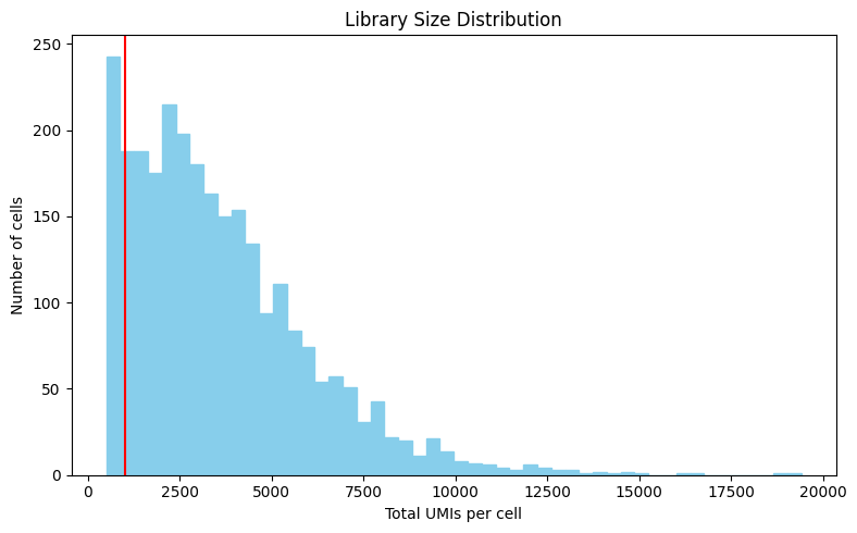
Keep cells with at least 1000 UMIs
1
2keep_rows = library_sizes > 1000
3bmmsc = bmmsc.loc[keep_rows, :]
4bmmsc
| 0610007C21Rik;Apr3 | 0610007L01Rik | 0610007P08Rik;Rad26l | 0610007P14Rik | 0610007P22Rik | 0610009B22Rik | 0610009D07Rik | 0610009O20Rik | 0610010F05Rik;mKIAA1841;Kiaa1841 | 0610010K14Rik;Rnasek | ... | mKIAA1632;5430411K18Rik | mKIAA1994;Tsc22d1 | mSox5L;Sox5 | mTPK1;Tpk1 | mimp3;Igf2bp3;AK045244 | rp9 | scmh1;Scmh1 | slc43a2;Slc43a2 | tsec-1;Tex9 | tspan-3;Tspan3 | |
|---|---|---|---|---|---|---|---|---|---|---|---|---|---|---|---|---|---|---|---|---|---|
| W31106 | 0 | 0 | 0 | 1 | 0 | 0 | 0 | 0 | 0 | 1 | ... | 0 | 0 | 0 | 0 | 0 | 1 | 1 | 0 | 0 | 0 |
| W31107 | 0 | 1 | 0 | 2 | 0 | 0 | 0 | 0 | 0 | 3 | ... | 0 | 2 | 0 | 0 | 0 | 3 | 1 | 0 | 0 | 2 |
| W31108 | 0 | 1 | 0 | 1 | 0 | 0 | 0 | 0 | 0 | 3 | ... | 0 | 0 | 0 | 0 | 0 | 3 | 1 | 0 | 0 | 0 |
| W31109 | 0 | 0 | 1 | 0 | 0 | 0 | 1 | 3 | 0 | 8 | ... | 0 | 5 | 0 | 0 | 0 | 5 | 0 | 0 | 0 | 0 |
| W31110 | 0 | 1 | 0 | 0 | 0 | 0 | 0 | 1 | 0 | 1 | ... | 0 | 0 | 0 | 0 | 0 | 3 | 0 | 0 | 0 | 1 |
| ... | ... | ... | ... | ... | ... | ... | ... | ... | ... | ... | ... | ... | ... | ... | ... | ... | ... | ... | ... | ... | ... |
| W39163 | 0 | 2 | 1 | 0 | 0 | 0 | 0 | 0 | 0 | 1 | ... | 0 | 0 | 0 | 0 | 0 | 0 | 0 | 0 | 0 | 0 |
| W39164 | 0 | 0 | 1 | 0 | 0 | 0 | 0 | 0 | 0 | 1 | ... | 0 | 0 | 0 | 0 | 0 | 4 | 0 | 0 | 0 | 0 |
| W39165 | 1 | 0 | 0 | 1 | 0 | 0 | 0 | 0 | 0 | 7 | ... | 2 | 0 | 0 | 0 | 0 | 1 | 0 | 0 | 0 | 0 |
| W39167 | 1 | 3 | 0 | 0 | 0 | 0 | 0 | 0 | 0 | 3 | ... | 0 | 0 | 0 | 0 | 0 | 1 | 0 | 0 | 0 | 0 |
| W39168 | 0 | 0 | 0 | 0 | 0 | 0 | 0 | 0 | 0 | 4 | ... | 1 | 1 | 0 | 0 | 0 | 1 | 1 | 1 | 0 | 1 |
2414 rows × 10738 columns
Normalize the data using library size
1bmmsc_norm = scprep.normalize.library_size_normalize(bmmsc)
2bmmsc_norm
| 0610007C21Rik;Apr3 | 0610007L01Rik | 0610007P08Rik;Rad26l | 0610007P14Rik | 0610007P22Rik | 0610009B22Rik | 0610009D07Rik | 0610009O20Rik | 0610010F05Rik;mKIAA1841;Kiaa1841 | 0610010K14Rik;Rnasek | ... | mKIAA1632;5430411K18Rik | mKIAA1994;Tsc22d1 | mSox5L;Sox5 | mTPK1;Tpk1 | mimp3;Igf2bp3;AK045244 | rp9 | scmh1;Scmh1 | slc43a2;Slc43a2 | tsec-1;Tex9 | tspan-3;Tspan3 | |
|---|---|---|---|---|---|---|---|---|---|---|---|---|---|---|---|---|---|---|---|---|---|
| W31106 | 0.000000 | 0.000000 | 0.000000 | 2.480774 | 0.0 | 0.0 | 0.000000 | 0.000000 | 0.0 | 2.480774 | ... | 0.000000 | 0.000000 | 0.0 | 0.0 | 0.0 | 2.480774 | 2.480774 | 0.000000 | 0.0 | 0.000000 |
| W31107 | 0.000000 | 1.291823 | 0.000000 | 2.583646 | 0.0 | 0.0 | 0.000000 | 0.000000 | 0.0 | 3.875468 | ... | 0.000000 | 2.583646 | 0.0 | 0.0 | 0.0 | 3.875468 | 1.291823 | 0.000000 | 0.0 | 2.583646 |
| W31108 | 0.000000 | 1.415629 | 0.000000 | 1.415629 | 0.0 | 0.0 | 0.000000 | 0.000000 | 0.0 | 4.246886 | ... | 0.000000 | 0.000000 | 0.0 | 0.0 | 0.0 | 4.246886 | 1.415629 | 0.000000 | 0.0 | 0.000000 |
| W31109 | 0.000000 | 0.000000 | 1.154468 | 0.000000 | 0.0 | 0.0 | 1.154468 | 3.463403 | 0.0 | 9.235742 | ... | 0.000000 | 5.772339 | 0.0 | 0.0 | 0.0 | 5.772339 | 0.000000 | 0.000000 | 0.0 | 0.000000 |
| W31110 | 0.000000 | 4.237288 | 0.000000 | 0.000000 | 0.0 | 0.0 | 0.000000 | 4.237288 | 0.0 | 4.237288 | ... | 0.000000 | 0.000000 | 0.0 | 0.0 | 0.0 | 12.711864 | 0.000000 | 0.000000 | 0.0 | 4.237288 |
| ... | ... | ... | ... | ... | ... | ... | ... | ... | ... | ... | ... | ... | ... | ... | ... | ... | ... | ... | ... | ... | ... |
| W39163 | 0.000000 | 8.714597 | 4.357298 | 0.000000 | 0.0 | 0.0 | 0.000000 | 0.000000 | 0.0 | 4.357298 | ... | 0.000000 | 0.000000 | 0.0 | 0.0 | 0.0 | 0.000000 | 0.000000 | 0.000000 | 0.0 | 0.000000 |
| W39164 | 0.000000 | 0.000000 | 1.249375 | 0.000000 | 0.0 | 0.0 | 0.000000 | 0.000000 | 0.0 | 1.249375 | ... | 0.000000 | 0.000000 | 0.0 | 0.0 | 0.0 | 4.997501 | 0.000000 | 0.000000 | 0.0 | 0.000000 |
| W39165 | 1.758087 | 0.000000 | 0.000000 | 1.758087 | 0.0 | 0.0 | 0.000000 | 0.000000 | 0.0 | 12.306610 | ... | 3.516174 | 0.000000 | 0.0 | 0.0 | 0.0 | 1.758087 | 0.000000 | 0.000000 | 0.0 | 0.000000 |
| W39167 | 1.916810 | 5.750431 | 0.000000 | 0.000000 | 0.0 | 0.0 | 0.000000 | 0.000000 | 0.0 | 5.750431 | ... | 0.000000 | 0.000000 | 0.0 | 0.0 | 0.0 | 1.916810 | 0.000000 | 0.000000 | 0.0 | 0.000000 |
| W39168 | 0.000000 | 0.000000 | 0.000000 | 0.000000 | 0.0 | 0.0 | 0.000000 | 0.000000 | 0.0 | 3.862122 | ... | 0.965531 | 0.965531 | 0.0 | 0.0 | 0.0 | 0.965531 | 0.965531 | 0.965531 | 0.0 | 0.965531 |
2414 rows × 10738 columns
Sqrt transformation as before
1bmmsc_norm = scprep.transform.sqrt(bmmsc_norm)
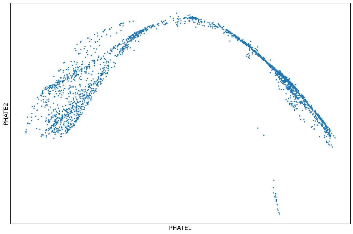
Define PHATE operator and run PHATE
1phate_operator = phate.PHATE(n_jobs=-2)
2Y_phate2 = phate_operator.fit_transform(bmmsc_norm)
Calculating PHATE...
  Running PHATE on 2414 observations and 10738 variables.
  Calculating graph and diffusion operator...
    Calculating PCA...
    Calculated PCA in 2.14 seconds.
    Calculating KNN search...
    Calculated KNN search in 0.20 seconds.
    Calculating affinities...
    Calculated affinities in 0.04 seconds.
  Calculated graph and diffusion operator in 2.41 seconds.
  Calculating landmark operator...
    Calculating SVD...
    Calculated SVD in 0.14 seconds.
    Calculating KMeans...
    Calculated KMeans in 0.99 seconds.
  Calculated landmark operator in 1.58 seconds.
  Calculating optimal t...
    Automatically selected t = 17
  Calculated optimal t in 0.87 seconds.
  Calculating diffusion potential...
  Calculated diffusion potential in 0.21 seconds.
  Calculating metric MDS...
  Calculated metric MDS in 2.47 seconds.
Calculated PHATE in 7.55 seconds.
Check
1scprep.plot.scatter2d(Y_phate2, figsize=(12,8), ticks=False, label_prefix="PHATE")
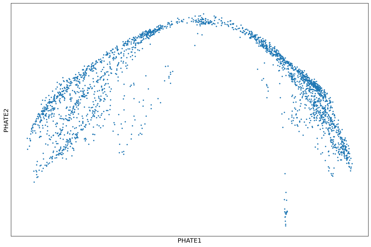
1phate_operator = phate.PHATE(knn=4, decay=100, t=10, n_jobs=-2)
2Y_phate3 = phate_operator.fit_transform(bmmsc_norm)
3scprep.plot.scatter2d(Y_phate3, figsize=(12,8), ticks=False, label_prefix="PHATE")
Calculating PHATE...
  Running PHATE on 2414 observations and 10738 variables.
  Calculating graph and diffusion operator...
    Calculating PCA...
    Calculated PCA in 2.31 seconds.
    Calculating KNN search...
    Calculated KNN search in 0.18 seconds.
    Calculating affinities...
  Calculated graph and diffusion operator in 2.53 seconds.
  Calculating landmark operator...
    Calculating SVD...
    Calculated SVD in 0.08 seconds.
    Calculating KMeans...
    Calculated KMeans in 1.21 seconds.
  Calculated landmark operator in 1.75 seconds.
  Calculating diffusion potential...
  Calculated diffusion potential in 0.15 seconds.
  Calculating metric MDS...
  Calculated metric MDS in 2.59 seconds.
Calculated PHATE in 7.02 seconds.
Set operator for 3D PHATE
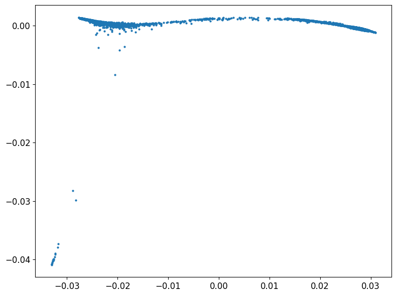
1phate_operator.set_params(n_components=3)
PHATE(decay=100, knn=4, n_components=3, n_jobs=-2, t=10)In a Jupyter environment, please rerun this cell to show the HTML representation or trust the notebook.
On GitHub, the HTML representation is unable to render, please try loading this page with nbviewer.org.
PHATE(decay=100, knn=4, n_components=3, n_jobs=-2, t=10)
PHATE 3D
1Y_phate4 = phate_operator.fit_transform(bmmsc_norm)
Calculating PHATE...
  Running PHATE on 2414 observations and 10738 variables.
  Calculating graph and diffusion operator...
    Calculating PCA...
    Calculated PCA in 2.43 seconds.
    Calculating KNN search...
    Calculated KNN search in 0.20 seconds.
    Calculating affinities...
  Calculated graph and diffusion operator in 2.68 seconds.
  Calculating landmark operator...
    Calculating SVD...
    Calculated SVD in 0.12 seconds.
    Calculating KMeans...
    Calculated KMeans in 1.20 seconds.
  Calculated landmark operator in 1.77 seconds.
  Calculating diffusion potential...
  Calculated diffusion potential in 0.16 seconds.
  Calculating metric MDS...
  Calculated metric MDS in 14.05 seconds.
Calculated PHATE in 18.66 seconds.
3D interactive plotly using Mpo gene to label myeloid cells
 1df3 = pd.DataFrame(Y_phate4, columns=['x', 'y', 'z'])
 2df3['Mpo'] = bmmsc_norm['Mpo'].values
 3fig = px.scatter_3d(
 4    df3,
 5    x='x',
 6    y='y',
 7    z='z',
 8    color='Mpo',
 9    color_continuous_scale="Plasma",
10
11)
12
13fig.update_traces(marker=dict(size=2))
14
15fig.update_layout(
16    legend=dict(
17        itemsizing='constant',
18        font=dict(size=12)
19    ),
20    scene=dict(
21        xaxis=dict(
22            title='PHATE 1',
23            showticklabels=False,
24            showline=True,
25            zeroline=False,
26            linecolor='black',
27            backgroundcolor='rgba(0,0,0,0)',
28            gridcolor='lightgrey',
29            showgrid=True
30        ),
31        yaxis=dict(
32            title='PHATE 2',
33            showticklabels=False,
34            showline=True,
35            zeroline=False,
36            linecolor='black',
37            backgroundcolor='rgba(0,0,0,0)',
38            gridcolor='lightgrey',
39            showgrid=True
40        ),
41        zaxis=dict(
42            title='PHATE 3',
43            showticklabels=False,
44            showline=True,
45            zeroline=False,
46            linecolor='black',
47            backgroundcolor='rgba(0,0,0,0)',
48            gridcolor='lightgrey',
49            showgrid=True
50        )
51    )
52)
53fig.write_html("../../../static/images/plot4.html", include_plotlyjs="embed")
Click here to view the interactive plot
Inspired by the tree PHATE examples I decided to use a similar approach here.
1phate_operator = phate.PHATE(knn=4, decay=100, t=120, n_jobs=-2, gamma = 0)
2Y_phate_tree = phate_operator.fit_transform(bmmsc_norm)
Calculating PHATE...
  Running PHATE on 2414 observations and 10738 variables.
  Calculating graph and diffusion operator...
    Calculating PCA...
    Calculated PCA in 2.12 seconds.
    Calculating KNN search...
    Calculated KNN search in 0.19 seconds.
    Calculating affinities...
  Calculated graph and diffusion operator in 2.35 seconds.
  Calculating landmark operator...
    Calculating SVD...
    Calculated SVD in 0.09 seconds.
    Calculating KMeans...
    Calculated KMeans in 1.38 seconds.
  Calculated landmark operator in 1.91 seconds.
  Calculating diffusion potential...
  Calculated diffusion potential in 0.31 seconds.
  Calculating metric MDS...
  Calculated metric MDS in 2.49 seconds.
Calculated PHATE in 7.07 seconds.
1phate.plot.scatter2d(Y_phate_tree, figsize=(8,6))
but it did not work very well.
Use scanpy to create an AnnData object and visualize the data with UMAP.
1cdata = ad.AnnData(
2    X=sp.csr_matrix(bmmsc.values)
3)
Qc preprocessing
1sc.pp.calculate_qc_metrics(
2 cdata, inplace=True, log1p=True
3)
4
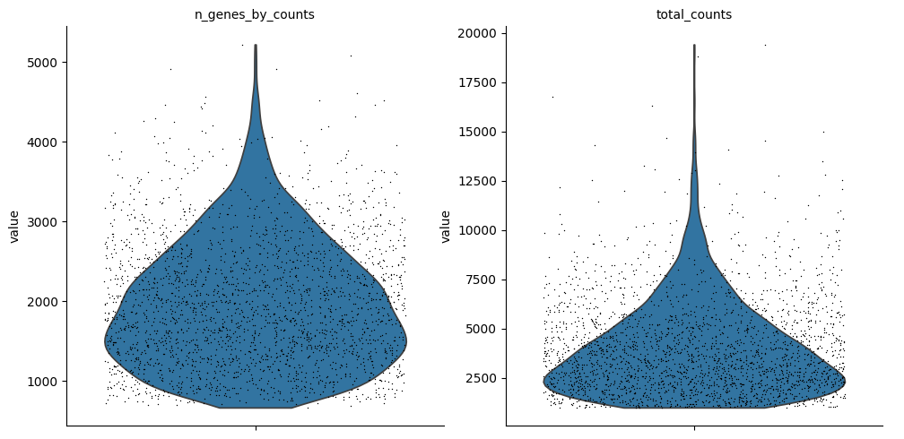
5sc.pl.violin(
6 cdata,
7 ["n_genes_by_counts", "total_counts"],
8 jitter=0.4,
9 multi_panel=True,
10)
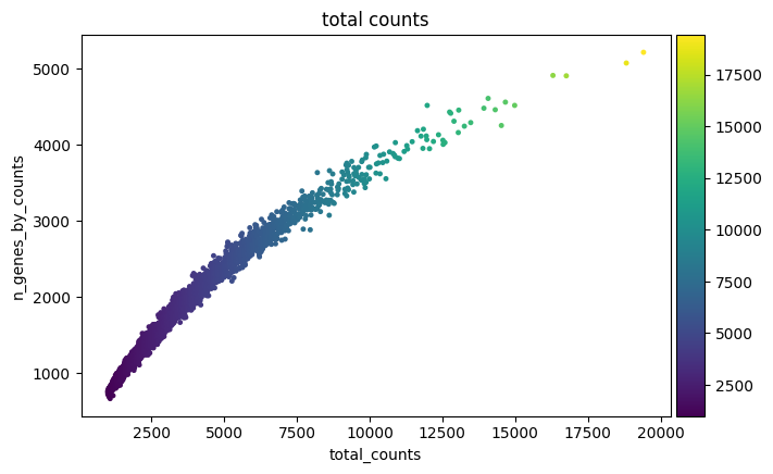
1sc.pl.scatter(cdata, "total_counts", "n_genes_by_counts", color="total_counts")
gene and cell filtering
1sc.pp.filter_cells(cdata, min_genes=100)
2sc.pp.filter_genes(cdata, min_cells=3)
Normalization
1# Saving count data
2cdata.layers["counts"] = cdata.X.copy()
3# Normalizing to median total counts
4sc.pp.normalize_total(cdata)
5# Logarithmize the data
6sc.pp.log1p(cdata)
Highly variable genes and PCA
1sc.pp.highly_variable_genes(cdata, n_top_genes=2000)
2sc.tl.pca(cdata)
Neighbors and UMAP
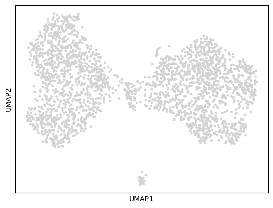
1sc.pp.neighbors(cdata)
2sc.tl.umap(cdata)
3sc.pl.umap(cdata)
3D UMAP
1sc.tl.umap(cdata, n_components=3, key_added='UMAP_3D')
Interactive plotly colorinbg by Mpo gene
 1df4 = pd.DataFrame(cdata.obsm['UMAP_3D'], columns=['x', 'y', 'z'])
 2df4['Mpo'] = bmmsc_norm['Mpo'].values
 3fig = px.scatter_3d(
 4    df4,
 5    x='x',
 6    y='y',
 7    z='z',
 8    color='Mpo',
 9    color_continuous_scale="Plasma",
10
11)
12
13fig.update_traces(marker=dict(size=2))
14
15fig.update_layout(
16    legend=dict(
17        itemsizing='constant',
18        font=dict(size=12)
19    ),
20    scene=dict(
21        xaxis=dict(
22            title='UMAP 1',
23            showticklabels=False,
24            showline=True,
25            zeroline=False,
26            linecolor='black',
27            backgroundcolor='rgba(0,0,0,0)',
28            gridcolor='lightgrey',
29            showgrid=True
30        ),
31        yaxis=dict(
32            title='UMAP 2',
33            showticklabels=False,
34            showline=True,
35            zeroline=False,
36            linecolor='black',
37            backgroundcolor='rgba(0,0,0,0)',
38            gridcolor='lightgrey',
39            showgrid=True
40        ),
41        zaxis=dict(
42            title='UMAP 3',
43            showticklabels=False,
44            showline=True,
45            zeroline=False,
46            linecolor='black',
47            backgroundcolor='rgba(0,0,0,0)',
48            gridcolor='lightgrey',
49            showgrid=True
50        )
51    )
52)
53fig.write_html("../../../static/images/plot5.html", include_plotlyjs="embed")
Click here to view the interactive plot
As in the EB dataset, PHATE and UMAP look different but the biological relationships stay the same both in 2D and 3D.
Pancreas Data set
I read the data from the same object as in the slingshot post, but this time using scanpy since we are working on Python.
1adata = sc.read('../2025-04-06-slingshot/endocrinogenesis_day15.h5ad')
2adata
AnnData object with n_obs × n_vars = 3696 × 27998
    obs: 'clusters_coarse', 'clusters', 'S_score', 'G2M_score'
    var: 'highly_variable_genes'
    uns: 'clusters_coarse_colors', 'clusters_colors', 'day_colors', 'neighbors', 'pca'
    obsm: 'X_pca', 'X_umap'
    layers: 'spliced', 'unspliced'
    obsp: 'distances', 'connectivities'
2D PHATE
1phate_operator = phate.PHATE(n_jobs=-2)
2pancreas_phate = phate_operator.fit_transform(adata.to_df())
Calculating PHATE...
  Running PHATE on 3696 observations and 27998 variables.
  Calculating graph and diffusion operator...
    Calculating PCA...
    Calculated PCA in 4.08 seconds.
    Calculating KNN search...
    Calculated KNN search in 0.32 seconds.
    Calculating affinities...
    Calculated affinities in 0.03 seconds.
  Calculated graph and diffusion operator in 4.51 seconds.
  Calculating landmark operator...
    Calculating SVD...
    Calculated SVD in 0.21 seconds.
    Calculating KMeans...
    Calculated KMeans in 2.07 seconds.
  Calculated landmark operator in 2.80 seconds.
  Calculating optimal t...
    Automatically selected t = 23
  Calculated optimal t in 1.59 seconds.
  Calculating diffusion potential...
  Calculated diffusion potential in 0.41 seconds.
  Calculating metric MDS...
  Calculated metric MDS in 3.35 seconds.
Calculated PHATE in 12.66 seconds.
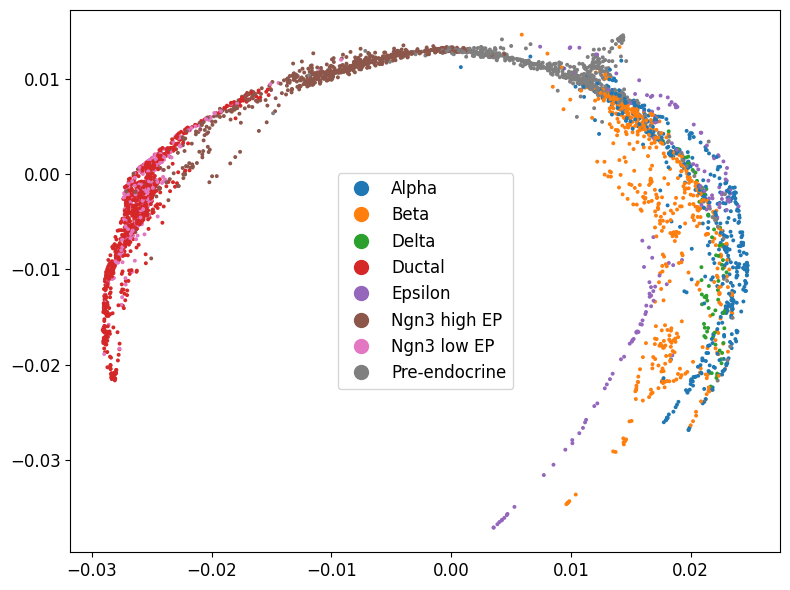
Plot coloring by cell type
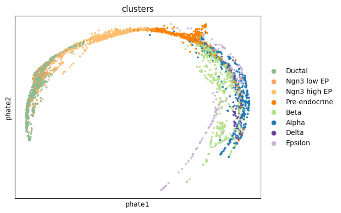
1phate.plot.scatter2d(pancreas_phate, c=adata.obs['clusters'], figsize=(8,6))
add PHATE coordinates to adata object
1adata.obsm['phate'] = pancreas_phate
plot using scanpy to get the same color scheme as in the next UMAP plot
1sc.pl.embedding(adata, 'phate', color = 'clusters')
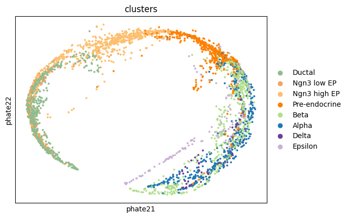
try different PHATE settings
1phate_operator = phate.PHATE(n_jobs=-2, knn=4, decay=100, t=10)
2pancreas_phate = phate_operator.fit_transform(adata.to_df())
Calculating PHATE...
  Running PHATE on 3696 observations and 27998 variables.
  Calculating graph and diffusion operator...
    Calculating PCA...
    Calculated PCA in 3.12 seconds.
    Calculating KNN search...
    Calculated KNN search in 0.34 seconds.
    Calculating affinities...
    Calculated affinities in 0.02 seconds.
  Calculated graph and diffusion operator in 3.54 seconds.
  Calculating landmark operator...
    Calculating SVD...
    Calculated SVD in 0.13 seconds.
    Calculating KMeans...
    Calculated KMeans in 1.31 seconds.
  Calculated landmark operator in 1.97 seconds.
  Calculating diffusion potential...
  Calculated diffusion potential in 0.22 seconds.
  Calculating metric MDS...
  Calculated metric MDS in 3.51 seconds.
Calculated PHATE in 9.24 seconds.
1adata.obsm['phate2'] = pancreas_phate
2sc.pl.embedding(adata, 'phate2', color = 'clusters')
Plot UMAP
1sc.pl.umap(adata, color = 'clusters')
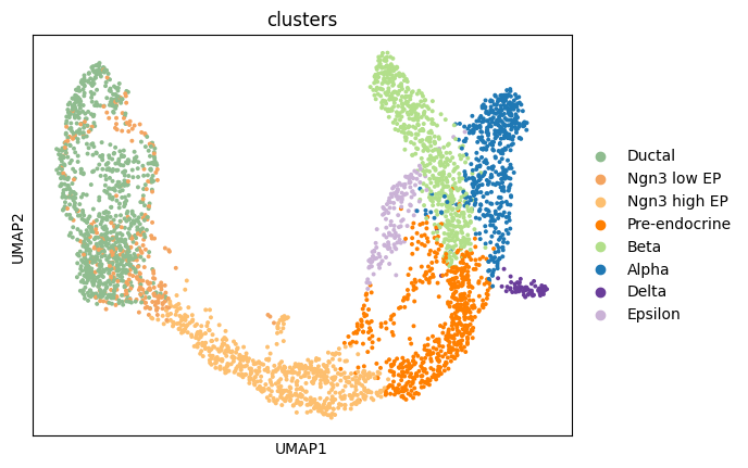
In this case, UMAP looks better with more clearly separated cell types.
Conclusions
- The PHATE seems to be working better, with default settings, is some datasets but worse in others.
- In general, UMAP seems to provide similar biological conclusions as PHATE, but the visualizations are different.
- As seen in my previous post for t-SNE and UMAP, parameters choice has a big impact on the results.
Take away
- t-SNE are directly integrated in SCE, Seurat and Scanpy so it is easy to use them.
- PHATE works natively in Python and, using reticulate, in R.
- I will start with t-SNE/UMAP representations and move to PHATE if I am not happy with the results.
Further reading
- Moon, K.R., van Dijk, D., Wang, Z. et al. Visualizing structure and transitions in high-dimensional biological data. Nat Biotechnol 37, 1482–1492 (2019). https://doi.org/10.1038/s41587-019-0336-3
- Bone Marrow paper: Paul, Franziska et al. 2015. Transcriptional Heterogeneity and Lineage Commitment in Myeloid Progenitors. Cell, Volume 163, Issue 7, 1663 - 1677
- PHATE github
- phateR github
- phateR Bone Marrow Tutorial
- Embryoid Body Notebook